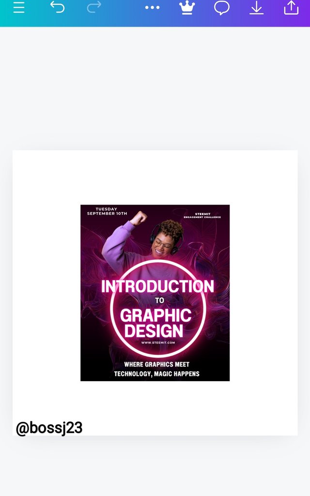
SEC20/WK2: Colour Theory and Application."
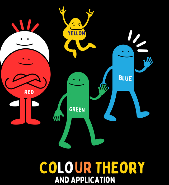
Edited using canva
This contest reminds me of my primary school days where we'd sing, if you mix red and yellow, it gives orange. We actually carried out those mixtures in our paint class, which has application in the digital world today. Colours are an expression. It defines something, and it's the reason for attraction. Placing so much emphasis on colours brings to mind that colour blending is very essential.
- You'll see someone wearing a white shirt, a black trouser, and a black shoe, and you'll be amazed at the colour combination.
- You'll see another wear a blue shirt, a red trouser, and a yellow shoe, and you'll be repelled at such shouting and repulsive colour blends.
We do hear of colour riots where colours repel each other as they are not a match. This digital space has it that colours can affect graphics in every aspect. The colours you use in designing a graphic will help you know if the first impression would be met if exposed to the public. For the purpose of this challenge, I'll be elaborating on the following questions:.
Discuss Colour Theory according to the way you understand it. |
|---|
Every theory has principles that follow and guide it, the same with colours. Sometimes I marvel at how God created nature in such a way that colours don't repel each other. Just imagine the sun has a red colour and the sky is orange. The colour principle was used in creation.
In the context of graphic design, **Colour theory states that colours used to design a particular element must be selected in such a way that they blend with the element and its environment, especially for those who view or look at these elements, provided the rules for blending remain constant.
This is my formulated theory in the way I understand colour theory in graphic design. It spells out why one must carefully choose and blend colours to create a first impression on one's graphics. You may decide to create a design, but your colours give it the real look. If you're going to a store, what captures your attention first?
- Is it the name of the product or the colour of the product? Let's assume you enter a boutique where clothes and shoes are sold. The colours attached to it give a first impression and make you look into them in awe.
Same with graphic design. Colour blending is necessary in giving our designed elements a good look and not making them repulsive. Let's assume we were on this design. Using green for agriculture makes a whole lot of impression and significance, but using colours like pink and purple makes it shouting and repulsive.
 A A |  B B |
|---|
Edited using canva
Choose "Two" from the colour scheme discussed, briefly talk about it, and demonstrate with two examples each showing how to combine colours using that scheme. |
|---|
Two schemes that relate the colour theory and help in effective and efficient colour choices are as follows:
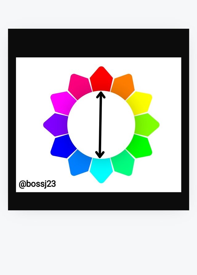
- Complementary colors: As the name implies, you need colours that complement themselves in whatever you do. Take a look at the pictures below. We can see that the arrow in picture A is complementing the colour opposite it in the colour wheel. This helps you bring a perfect colour combination for your graphics. **The second picture shows the disunity between colours as the arrow isn't pointing opposite to each other, which doesn't make it complementary in this context and may bring about shouting colours. They are opposite because of the sharp contrast between these two colours.
 A A | 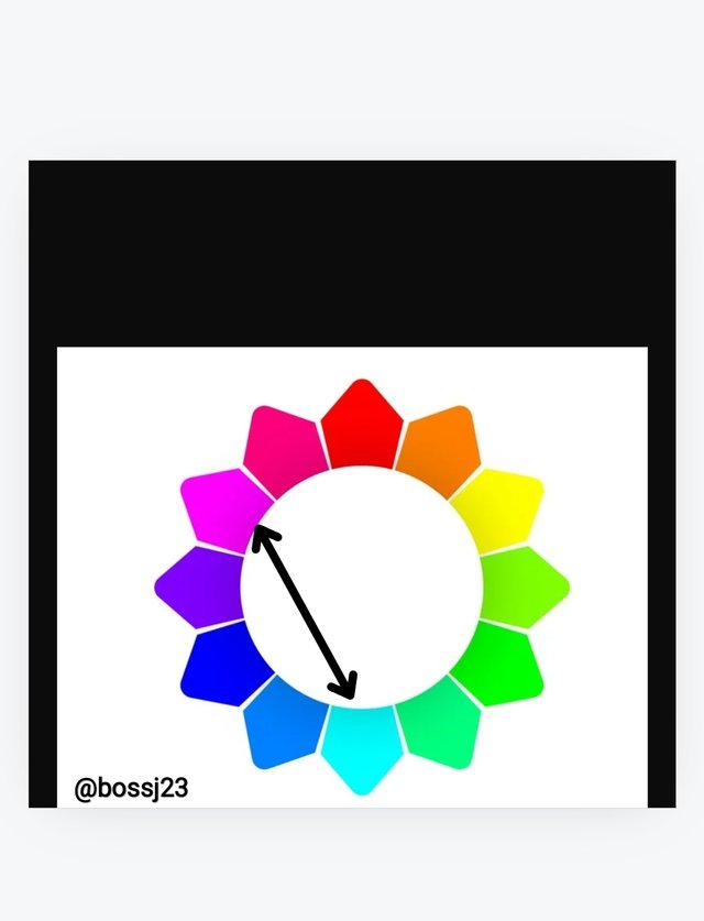 B B |
|---|
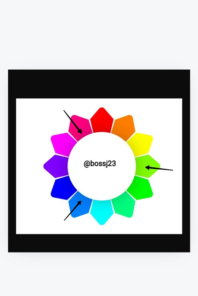
- Triadic colors: This can be defined as the evenly spaced spacing of colours around the colour wheel, which helps in blending colours properly as you may likely get matches that are distinct. It's more like a definite spacing pattern like 2:2:2, where you get to skip or space before placing the next colour as indicated on the arrows. These spacings help you blend, from which you may be able to choose distinct colours. Picture A shows the distinct arrangement of this 3:3:3, while picture B is the reverse.
 A A | 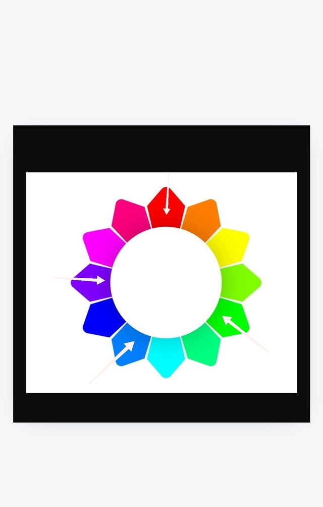 B B |
|---|
Demonstrate how to get your colour Hex from external object using your Canva design app. |
|---|
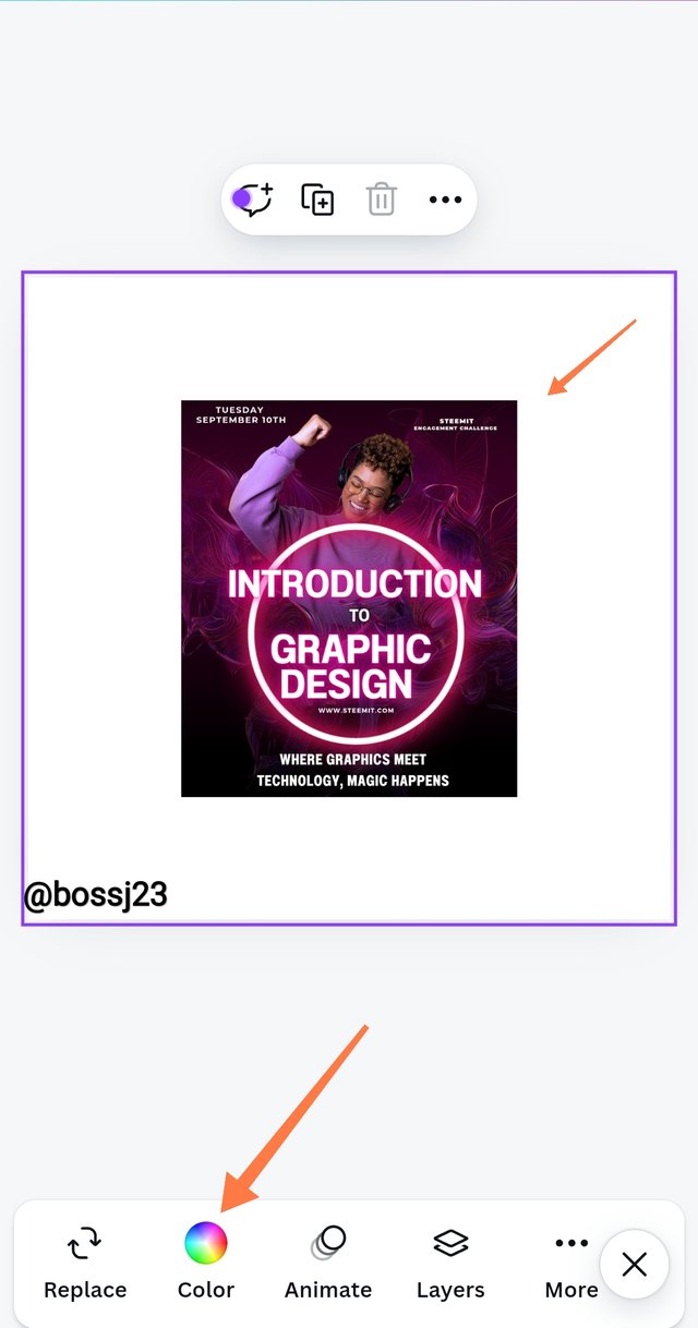
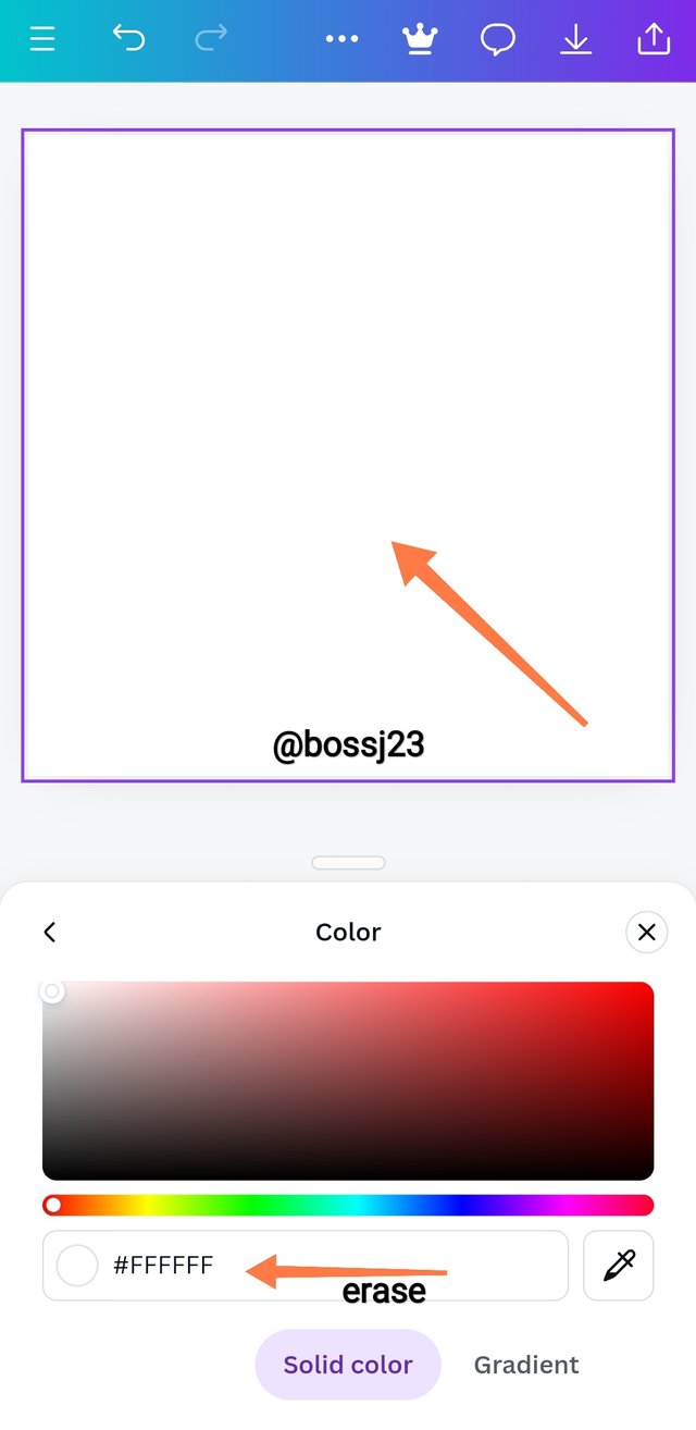
To get your colour Hex or codes from an external object using your Canva design app, you follow these procedures if you're using the Canva application.
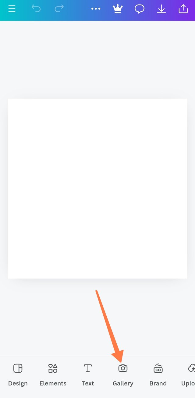
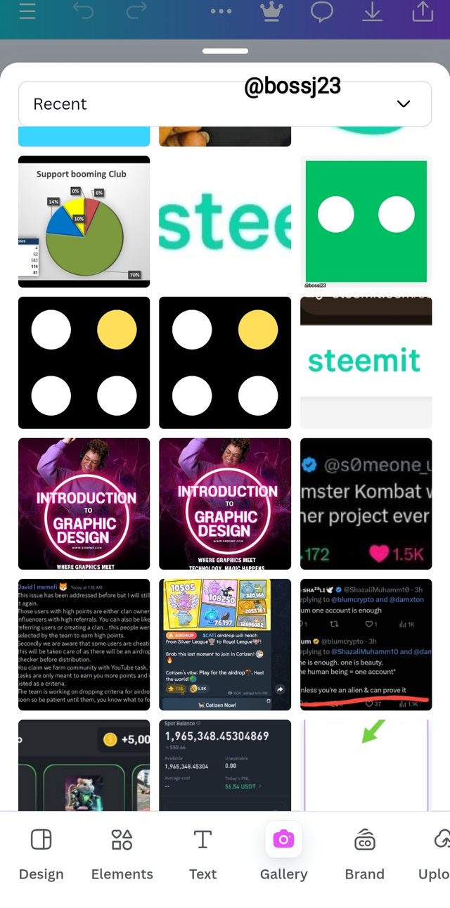
- You first of all launch your Canva app and then click on Instagram posts or whatever blank space you wish to use. When you attain a blank space option, you click on the GALLERY icon, which would take you to your photos, from which you can select any picture with colours.
 |  |  |
|---|
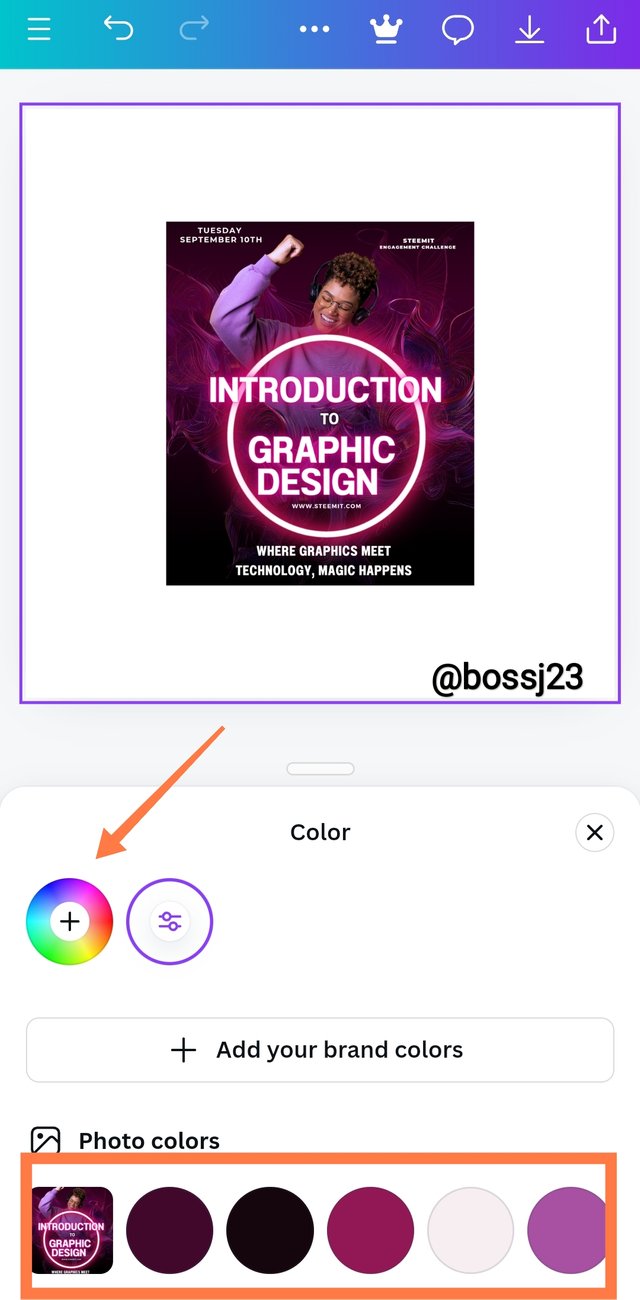
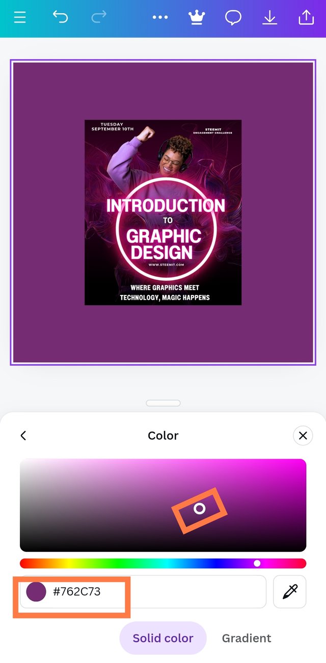
- I used my thumbnail for week 1 to get the Hex code. After selecting, you click on Add to page and allow it to load. Once it's added, you highlight the page by tapping on it and then click on Colours. After clicking on colours, a colour drawer would be displayed where you can see matching colours for the picture used.
 |  |  |
|---|
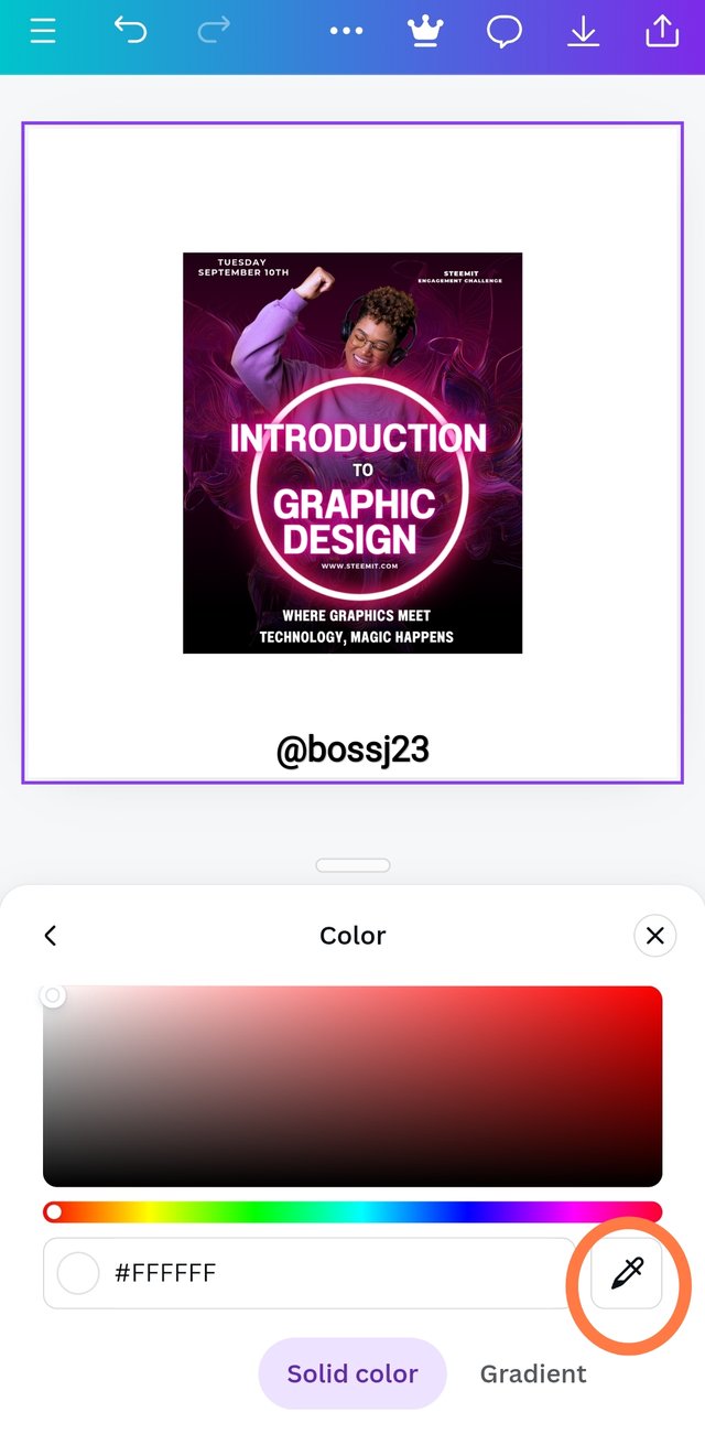
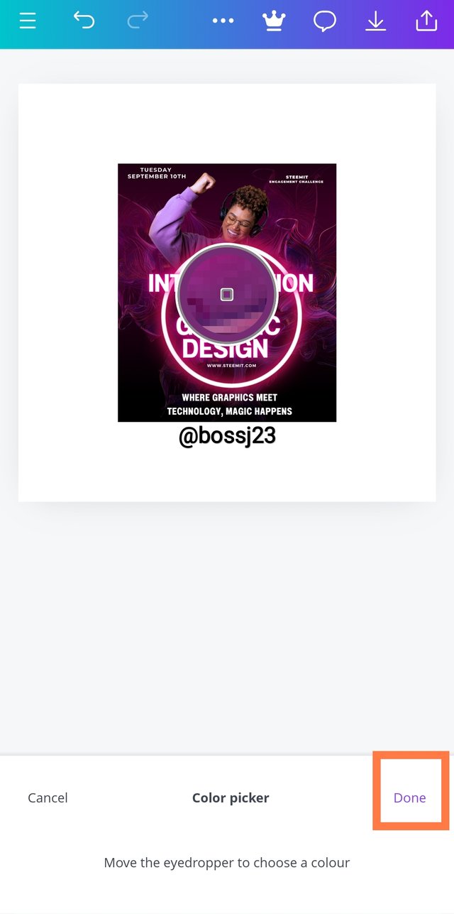
- For specification, you tap on the colour wheel and then click on picker. This picker helps pick the colour from the picture to the background, and that's how I got the colour and the Hex code being #762CR73
 |  |  |
|---|
Finally demonstrate how to get the colours behind the hex codes below |
|---|
This is more like the first procedure, but we'll not be using pictures. To get the colours behind the follow hex codes, I
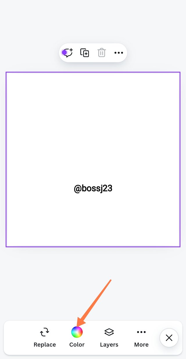
- got my blank space ready and then highlighted the page by tapping on it and then clicked on Colours. After clicking on colours, a colour drawer would be displayed where you can see several colours for use.
 |  |  |
|---|
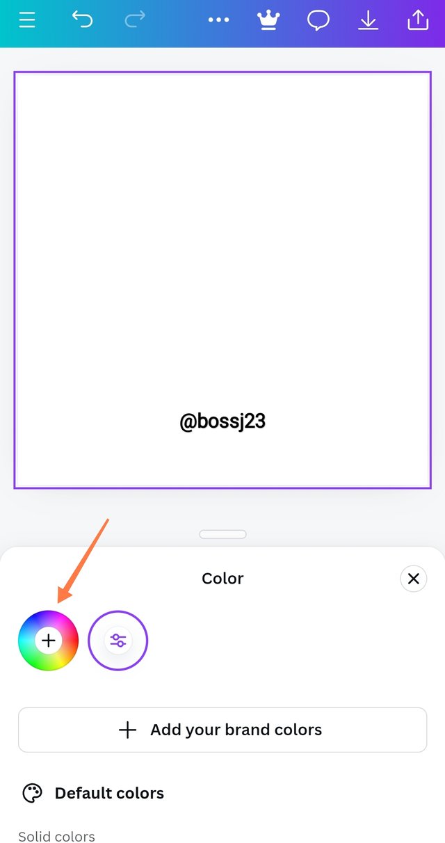
- I'll then click on the colour wheel where I was shown the bar for inputting hex codes. I removed the constant codes and replaced them with the ones given on the assignment, and it automatically showed me the colours. How easy!
#f3ca20 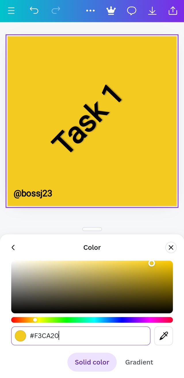 | #000000 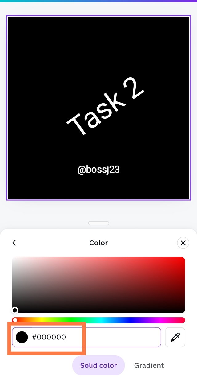 | #ef9d10f 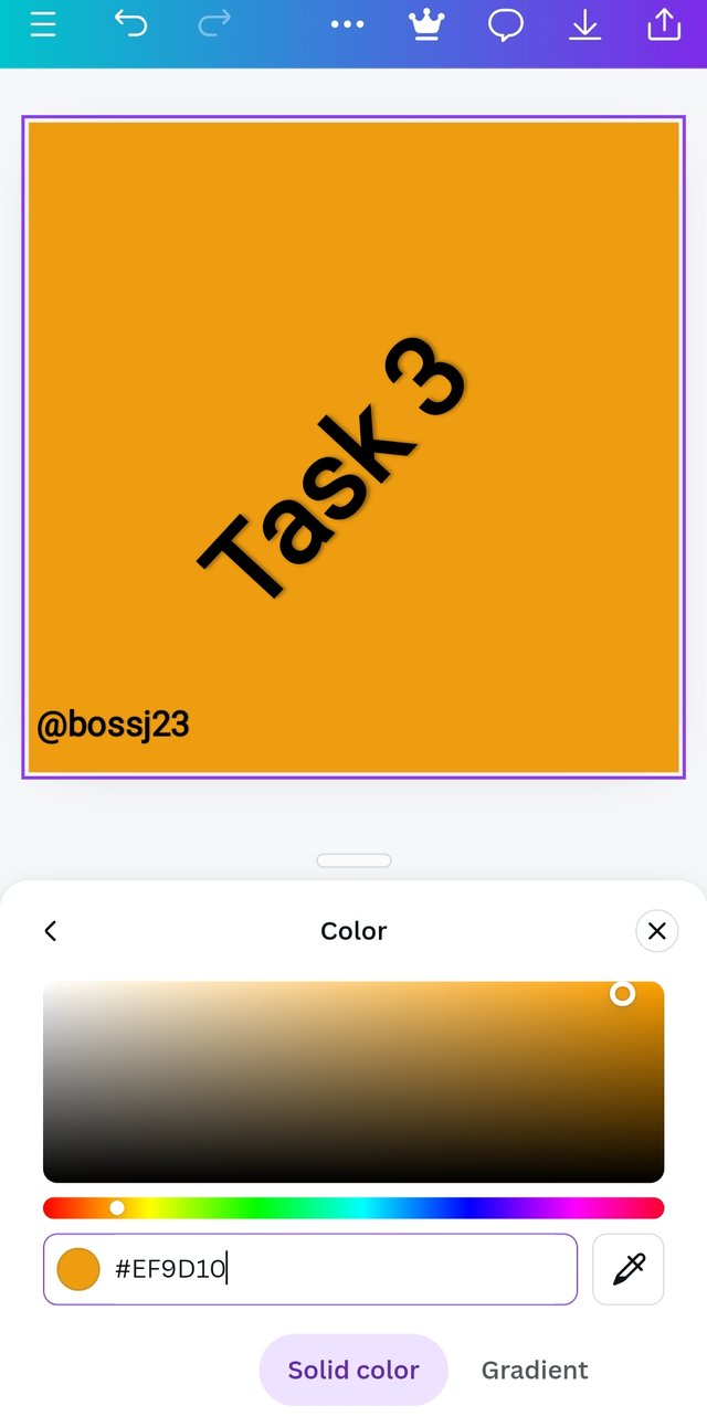 |
|---|
In conclusion, colours matter in everything we do. The earth we live on, the clothes we wear, the food, and the things we buy are all colourful, which attracts us, but we should beware of extreme colours as they are irritating, especially in this field. Your invitation cards, logos, and the like blend well and give a good impression to onlookers. I invite @mile16, @dove11 and @ngoenyi
Cc,
@lhorgic
Upvoted. Thank You for sending some of your rewards to @null. It will make Steem stronger.
https://x.com/bossj23Mod/status/1835481963722850316?t=jxX26eOQUlbr4hjFamQF9g&s=19
TEAM 5
Hello @bossj23 thank you for participating in this week's lesson. We have assessed your entry and we present the result of our assessment below.
Feedback:
• You have clearly defined Colour theory, the way you understand and I must say, I appreciate the details you put into your definition.
• Your selection on the colour scheme also looks really nice, you also formulated your using the wheel which is quite commendable. You didn't a good job.
• Finally, your practical on hex is quite detailed and comprehensive, showing every step all the way to the final result. In all, you did a good job. I hope you keep up with the energy level. Weldone.
Regards
@lhorgic❤️
Thank you for the invite. I have checked through your entry and see that you did great in explaining the topic under consideration in your own understanding as well as showing in practical ways how to carry out the assigned tasks. I wish you success
Thanks for the commendation. Practical courses like this usually takes time. At least I was able to conquer it. Thanks for seeing for to comment on my post. I'll check yours
I am Impressed with your publication. A great presentation of your knowledge. I like your cover photo too. It's unique and amazing. A detailed post, one can get help in this course if she or he read your post. All the very best to you.
Thank you much for appealing so much to my post. I really appreciate. I'll check your entry as well.