SEC20/WK2: Colour Theory and Application
Hello everyone!
I have joined Graphic Design course by @lhorgic under the umbrella of the great Steemit Team. If you have not joined it yet and want to join then
.png)
Colour theory is a framework. It explains how colours interact and evoke the emotional responses as well as how they are perceived. Colour theory revolves around the three primary aspects. These primary aspects are given below:
- The Colour
- Colour Harmony
- Context in which the Colours are used
1. The Colour Wheel:
The colour wheel is a visual representation of colours. In the colour wheel colours are arranged according to their chromatic relationships. A colour wheel further consists of three types of colours which are given below:
- Primary colour: Primary colours includes Red, yellow and blue. These cannot be created by mixing other colours. But other colours are created by mixing the order Mary colours.
- Secondary colours: Secondary colours include Green, orange and purple. Secondary colours are made up of mixing the primary colours. When we mix two primary colours then a new colour appear which is a secondary colour.
- Tertiary colours: Tertiary colours are made up of of primary and secondary colours. When primary and secondary colours are mixed then tertiary colours are produced. Red, orange or blue green are the examples of the tertiary colours.
2. Colour Harmony:
- Colour harmony refers to the balance and visual appeal of the colour. It is produced by combining the specific colours which look attractive and eye catching. Some common harmonies are given below:
- Complementary colours: These colours are opposite to each other in the colour wheel. For example red and green are the opposite colours on the colour wheel so these are the complementary colours. When we use these colours they produce high contrast design.
- Analogous colours: These are the colours which are next to each other on the wheel. For examples blue violet, blue and blue green are the analogous colours. They typically produce a harmonious and calming effect.
- Triadic colours: Three primary colours create triadic colour scheme. These colours are evenly spaced on the colour wheel. For example red, yellow and blue are the evenly spaced colours on the colour wheel. This creates a balanced colour scheme.
- Monochromatic: The variation of a single colour in different tones and shades is called monochromatic. They provides providing a cohesive and unified look.
3. Colour Properties:
- Hue: The basic colour such as ted, blue and green.
- Saturation: It is the intensity or purity of a colour. Highly saturated colours are vivid. But on the other hand desaturated colours are more muted or grayscale.
- Value: The brightness or darkness of a colour is called it's value. We can adjust the value of a colour by adding white or black shade to the base colour.
4. Psychological Impact of Colours:
- Different colours highlights unique emotional responses. For example:
- Warm colours are energising, passionate and attention catching. These colours include red, orange and yellow.
- Cool colours are calming and these are associated with the professionalism. These colours include blue, green and purple.
- Neutral colours are used as backgrounds to create beautiful design. Black, white, grey and beige are the neutral colours. They are used to balance the colours on the design.
5. Context and Perception:
- The meaning of colours can vary greatly depending on cultural contexts and individual experiences. For example red might symbolize love and warmth in some cultures. But in the other hand it can represent danger or warning.
- Colour perception also depends on surroundings. A colour can appear differently based on the lighting, textures and other nearby colours. We can relate it with our dressing as different colours of our dressing reflects our face colour different. Sometimes we look more fair than previous because of the difference of the colour which we are wearing.
Colour theory is very important and it is used to undertake the relationships and interactions of the colours to create effective and appealing designs. This colour theory is applied everywhere not just in graphic design. It had scope in the fashion and textile industry as well.
Choose "Two" from the colour scheme discussed, briefly talk about it and demonstrate with two examples each showing how to combine colours using that scheme
I have discussed some colour scheme above as well but now it is the time to demonstrate them with the help of the examples. So here are the two colour schemes learnt from the lecture of the professor with their examples.
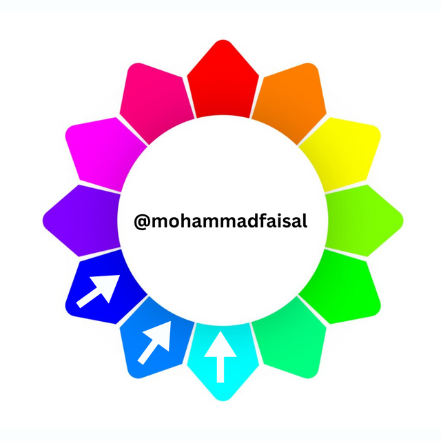
I will explain Analogous and Complimentary colour schemes here to demonstrate the use of the colour schemes.
Analogous Colours: These colour are next to each other on the colour wheel. These are the closely related colours to each other. The main or the dominant colour should always be in the center of the analogous colour.
| Example 1 | Example 2 |
|---|---|
.png) | 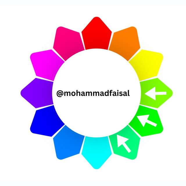.png) |
In the example 1 primary colour is blue and other colours are the surrounding colours.
In the example 2 primary colour is green and other 2 are surrounding colours.
So this is how analogous colours work.
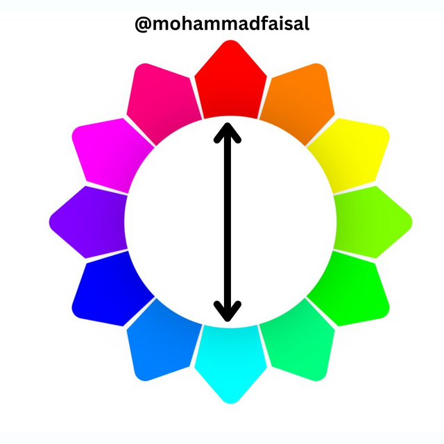
Complimentary Colours: Complimentary colours are the compliment of each other or we can simply say that these are the colours which are opposite to each other. We can use these colours when we need to add high contrast on our design. They highlight the message and make the important parts more highlighted because of contrast.
| Example 1 | Example 2 |
|---|---|
.png) | 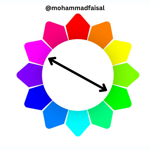.png) |
In the example 1 red and blue are the complimentary colours to each other as highlighted with the arrow. These are opposite to each other.
In the example 2 green and purple are are opposite to each other.
Demonstrate how to get your colour Hex from external object using your Canva design app.
First of all we have to import an image or any other object to get the Hex code of that object.
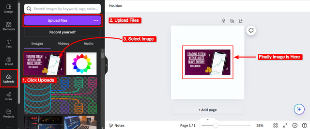
Steps to follow:
- Click Uploads
- Select
Upload Files - Click on the object you want to import
- I selected image and my image is on the screen.
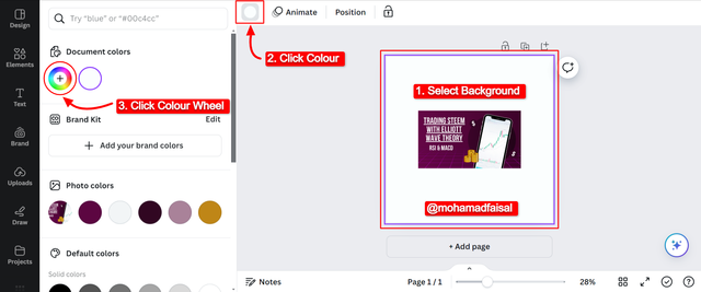
In order to turn on the colour picker we can follow these steps:
- Select the background
- Click on the by default colour
- Click on the custom colour wheel
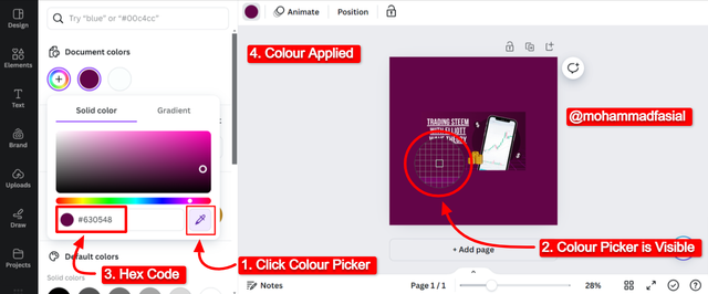
In order to get the Hex code from the external object we can follow these steps:
- Click on the colour picker with the pen like Icon.
- A zoom in colour picker in the circular form will appear.
- Click on the colour for which you want Hex code.
- I have clicked the external imported image and it applied the selected colour to the background.
- Under the colour picker hex code is now visible for the picked colour. The hex code is
#630548.
So in this way we can get the hex code of any external object.
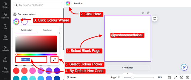
Finally demonstrate how to get the colours behind the hex codes below.
In order to pick the colours behined the code we can follow the below steps:
- First of all take a blank page for the good visibility of the colour
- Click on the blank page to enable colour editing
- Click on the by default colour
- Click on the colour wheel
- By default hex code for the white colour is visible
- We can check the colour behind the hex code by pasting the hex code in the hex code section of colour picker.
- Below is the visual representation of the steps.
Hex Codes:
a.#f3ca20
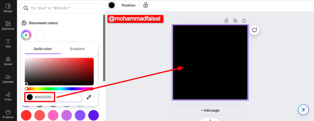
b.#000000
b.#ef9d10
a.#f3ca20
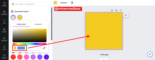
#f3ca20 is visible in the above picture b.#000000
#000000 is visible in the above picture c.#ef9d10
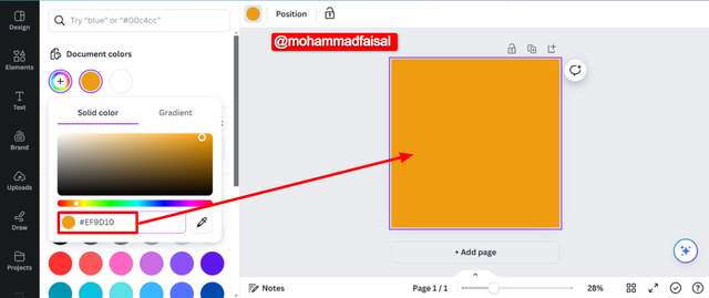
ef9d10 is visible in the above picture So in this way we can get colour with the help of the hex codes.
Conclusion
Colour theory in graphics design is of great importance. If we have master the colour theory we can make eye catching layouts of the designs. Colour theory tells us how to apply the colours which will enhance the design beauty. And it will surely enhance the user experience. And with correct usage of the colours we can convey our messages through the graphics in an efficient way. We can find the colour and the hex code of the colour from any external object with the help of the colour picker in canva. Similarly we can get the colour with the help of the hex codes.
Disclaimer: All the screenshots were taken from Canva Desktop version and the Colour Wheel has been used given by the professor @lhorgic otherwise stated.
X Promotion: https://x.com/stylishtiger3/status/1837350792153440423
Hello @mohammadfaisal thank you for participating in this week's lesson. We have assessed your entry and we present the result of our assessment below.
Feedback:
• You have clearly defined Colour theory the way you best understand it and I appreciate the remarkable effort you put into it.
• Your selection on colour scheme. Good to see that you clearly demonstrated how much you understand the use of those scheme by combining your colours appropriately...which is quite commendable.
• Finally, Your practical looks really nice in it presentation, looking very organized and comprehensive. In all, you did a good job. I hope you keep it up. Weldone.
Regards
@lhorgic❤️
Thank you for the appreciation 😌
Sungguh menarik bagaimana hal yang terlihat sepele ini sebenarnya tidak sesederhana kelihatannya.
Bro @mohammadfaisal, aplikasi apa yang Anda pakai untuk menghilangkan latar belakang pada foto Anda dalam editorial picture untuk artikel ini? Saya melihat hasil kerja yang smooth and clean.
Are you talking about color wheel?
If yes then I did not removed the background I just adjusted the picture in the canva by dragging it to fit in the frame.
Are you talking about color wheel?
The editorial picture
The background of the photograph has been smoothly cleaned out. Perfect job.
Thanks.
Ooh got it. It was an image provided by canva free version. I selected it there and edit it according to my requirements. The background colour was by default.
Ah! I thought it was you. Okay, then. My mistake. Have a great weekend.
Such a wonderful explanation of color theory. It is relevant and valuable for all creative people, not just designers. Good luck for the contest.