SEC20/WK2: Colour Theory and Application.
I’m @hudamalik20 from Pakistan, and I’m excited to participate in the SEC20/WK2: Colour Theory and Application contest organized by @lhorgic. This is the second contest week, and I’ve learned a lot through these experiences. I’m looking forward to applying what I’ve learned and hope to continue participating in future contests to keep growing and learning.🤗💞🌼🌸.So let's start.

• Discuss Colour Theory according to the way you understand it.
In my understanding, color theory is about how different colors work together and how we perceive them. Colors convey emotions and moods. For example, when we see red, it makes us feel energized and alert, while blue tends to make me feel relaxed, like when I look at the sky—it’s a soothing color. By combining the right colors that complement each other, we can create visually appealing and attractive designs.
I also learned that primary colors are red, blue, and yellow, and by mixing these, we can create other colors by adjusting their intensity. These three colors exist in nature, and we mix them to get a variety of different shades, much like when we used to play with clay as kids, mixing different colors to make new ones. Color theory works in a similar way by combining and adjusting colors to create harmonious results.
In everyday life, we constantly interact with colors, like traffic lights—red tells us to stop, green tells us to go, and yellow signals caution. Colors help shape our actions and thoughts, and in design, it’s crucial to choose colors wisely. Colors should complement each other rather than clash or create confusion, ensuring that the final design is balanced and visually pleasing.
• Choose "Two" from the colour scheme discussed, briefly talk about it and demonstrate with two examples each showing how to combine colours using that scheme.
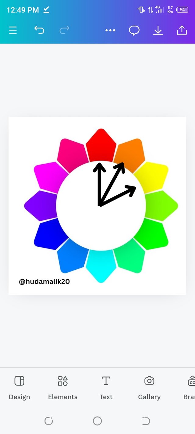
Complementary Colors:
Complementary colors are those that are directly opposite each other on the color wheel. When used together, they create a strong contrast and a vibrant look, making the design stand out. This high contrast enhances visual appeal and helps highlight important elements effectively.
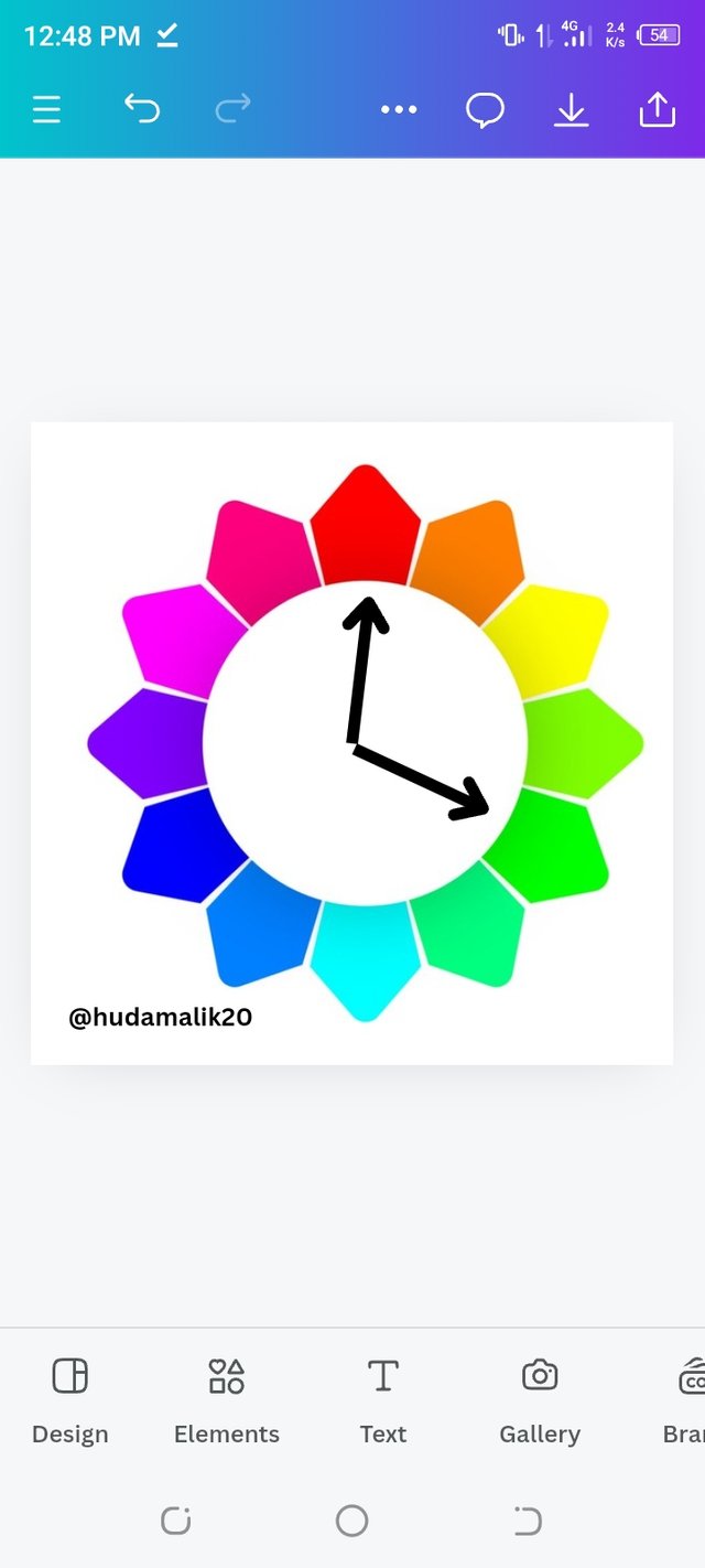 |  |
|---|
In Christmas decorations, red and green are often paired. For instance, you might see red ornaments on a green Christmas tree or red and green lights on houses. This combination creates a festive and eye-catching atmosphere, perfect for the holiday season.
Some restaurants use yellow and purple for their signs. Imagine a sign with a yellow background and purple text. This combination creates a vibrant, noticeable sign that attracts attention, helping it stand out and be easily remembered.
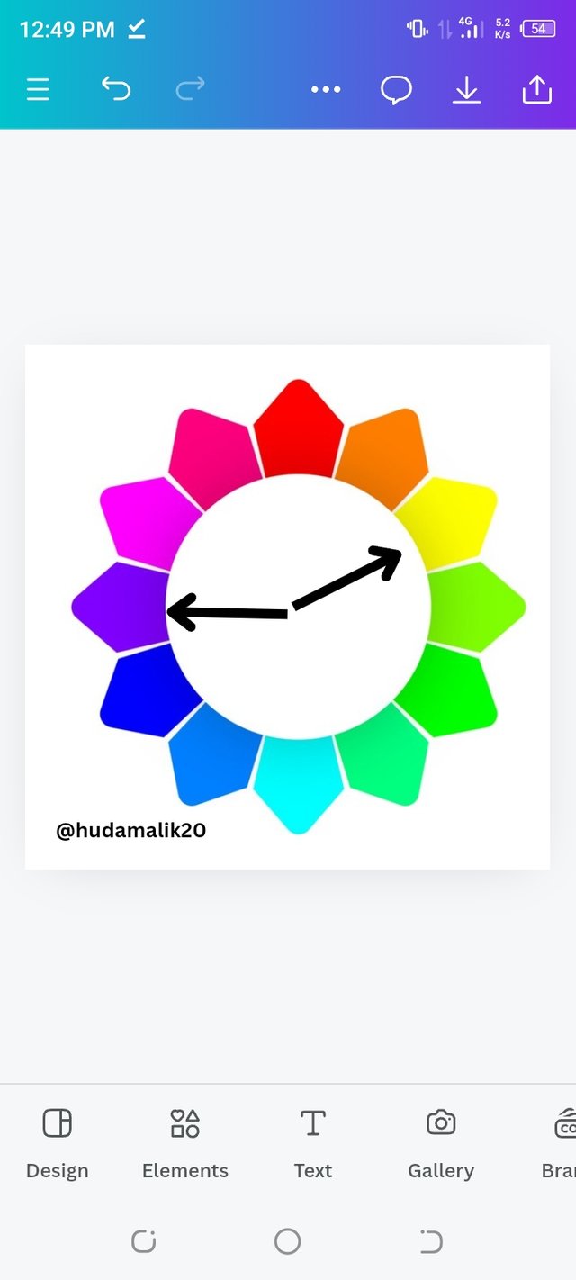
Analogous Colors:
Analogous colors are those that are next to each other on the color wheel. When combined, they blend harmoniously, creating a pleasing and cohesive look. These colors provide a soft and smooth visual experience.
During a beach sunset, you often see a blend of orange, red, and yellow. These analogous colors mix seamlessly to form a vibrant gradient, creating a calming and visually stunning effect. The smooth transition between these colors enhances the serene beauty of the sunset.
 | 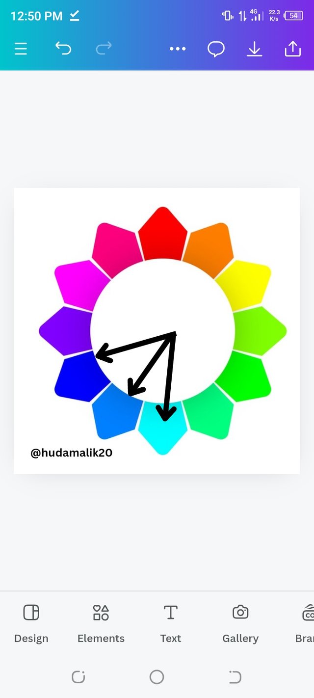 |
|---|
For decorating a living room, using light blue, blue, and teal can create a relaxed and inviting space. Light blue walls, navy blue curtains, and teal cushions come together to provide a soothing and unified look, making the room feel comfortable and aesthetically pleasing.
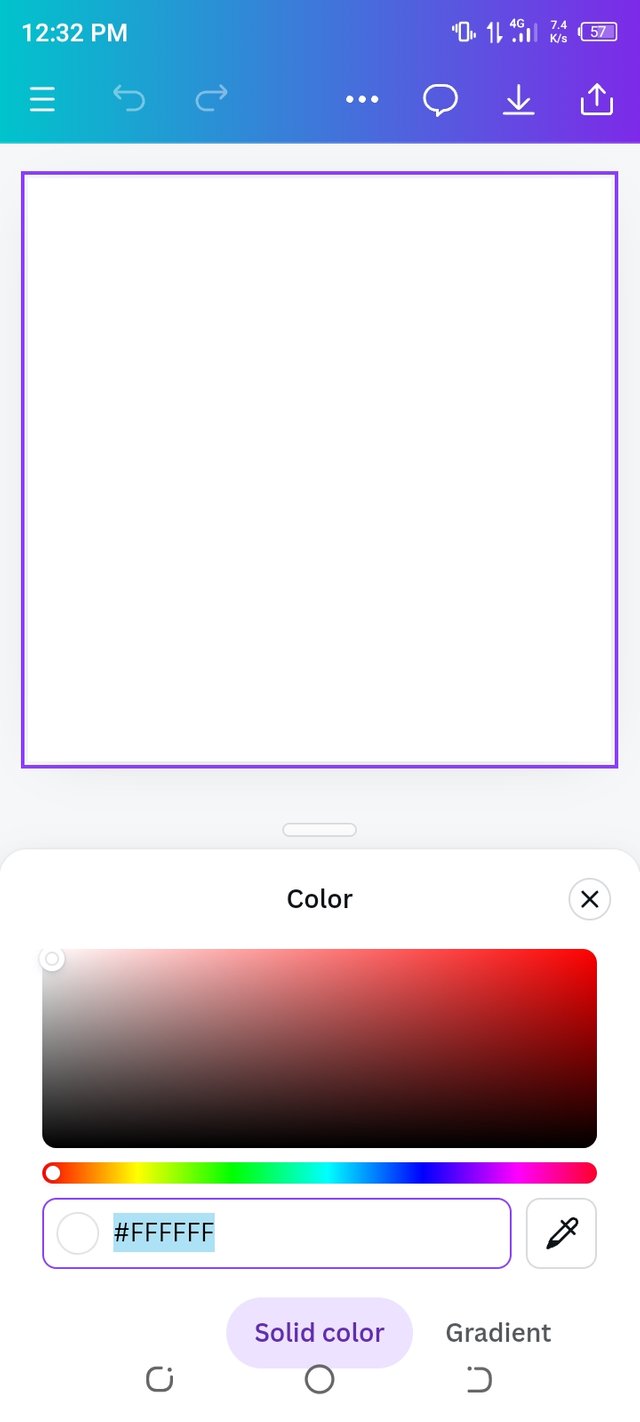
• Demonstrate how to get your colour Hex from external object using your Canva design app.
To get the color hex code from an external object using the Canva app, I start by opening Canva and selecting “Instagram Post (1080 x 1080)” to create a new design.
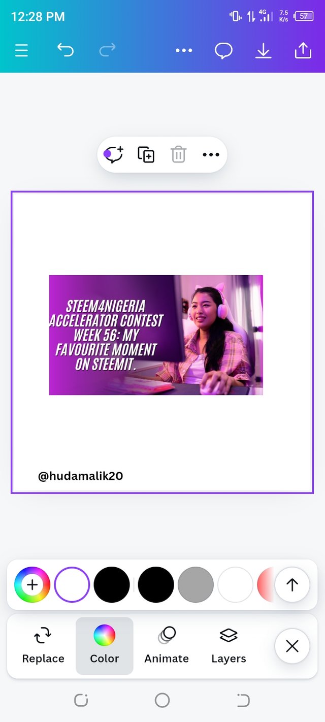
Next, I click on the “Gallery” option and choose a picture from my photo library, like the thumbnail from a contest post.
I then drag and drop this image onto my design canvas. After placing the image, I click on the “Background” option or use the “Elements” tab to add a new background.
 |  |  |
|---|
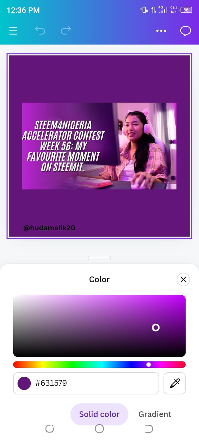
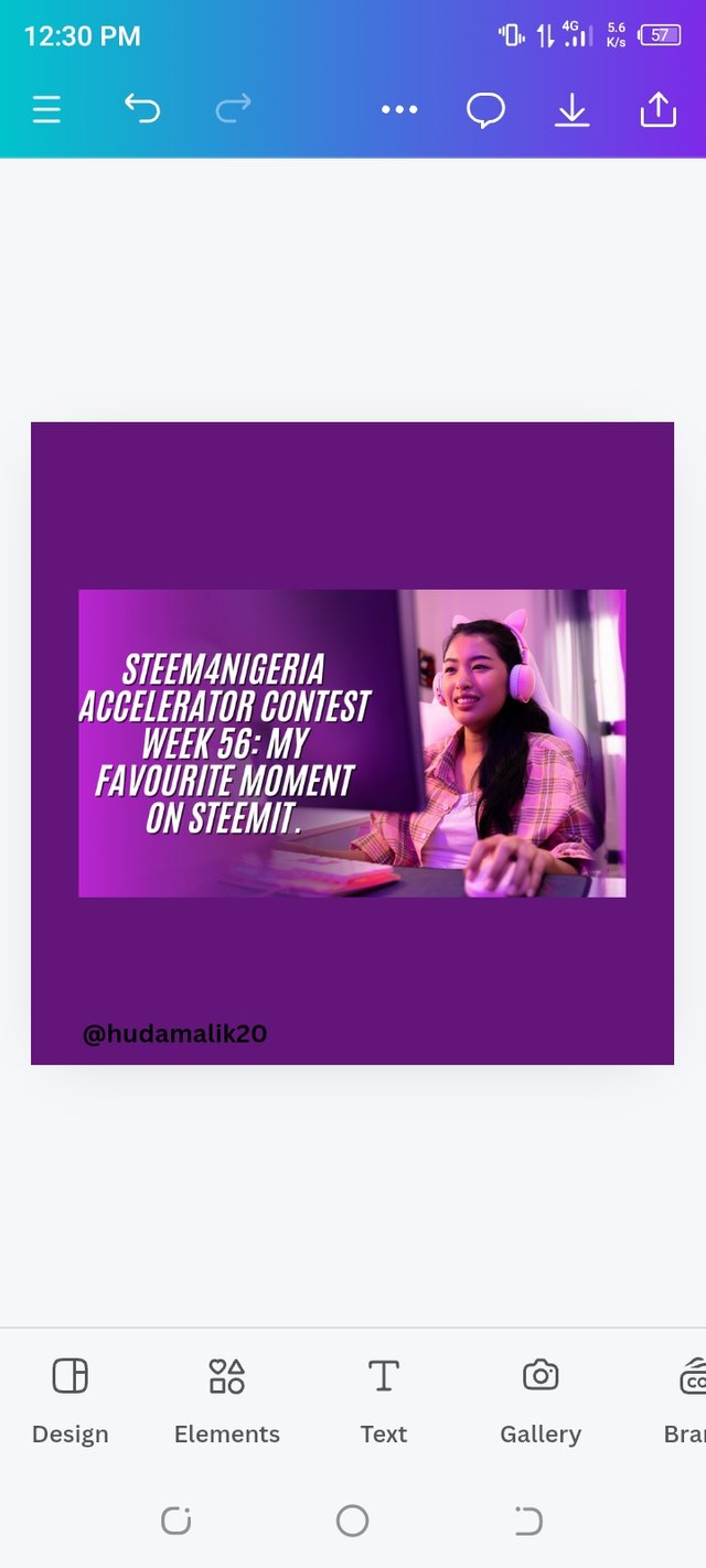
I choose a background color or image that looks good with the thumbnail and adjust it to ensure it blends well.
 |  |
|---|
To find the hex code of a color, I tap on the thumbnail image to select it, then click on the “Color” option in the toolbar.
I use the color picker tool to select the part of the image from which I want to extract the color. Canva will then show me the hex code for the selected color, which I can copy and use as needed.
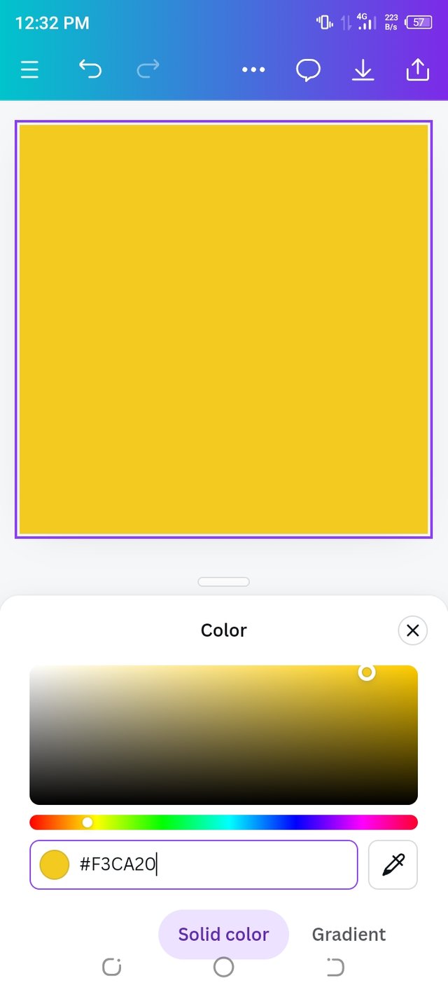
• Finally demonstrate how to get the colours behind the hex codes below.
a.#f3ca20
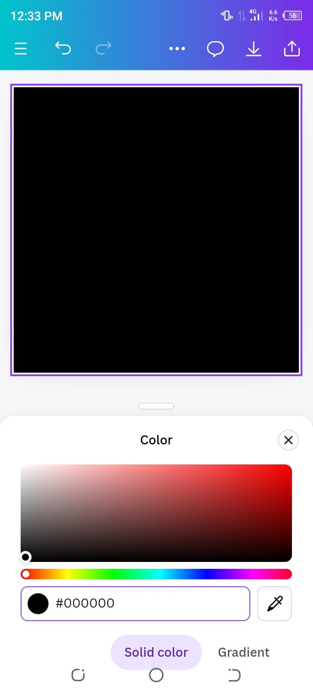
b.#000000
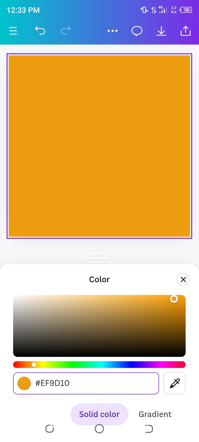
c.#ef9d10f
To get the colors behind the hex codes, I first open Canva and tap on the “Plus” button to create a new design.
I select “Instagram Post” (1080 x 1080) as the design format. Then, I click on the “Background” option and access the color settings.
 |  |
|---|
In the color settings, I find an option to enter a hex code. I erase the existing hex code and type in the first hex code, #f3ca20.
This changes the background color to match the hex code I entered. I repeat this process for the other hex codes: #000000 and #ef9d10.
After applying each hex code, I take a screenshot of the background color to capture how it looks.
 |  |  |
|---|
By doing this, I can see the colors corresponding to each hex code and understand how they appear in Canva. Now, I know how to use and copy these hex codes for future design purposes.
That's it from today's blog I hope you will like it. With best wishes ❤️. Now I like to invite @paholags, @yenny47 and @mile16 to participate in this amazing contest.
Thanks alot for reading ❤️🤗 .
My introduction post
Upvoted! Thank you for supporting witness @jswit.
Hey thanks so much for the feedback.I appreciate you pointing out the areas I can improve, especially with the complementary colors and the hex code steps.
I'll definitely keep that in mind for my future posts and try to be more detailed next time. Really glad you liked the overall effort, and I’ll keep pushing to do better. Thanks again for the support🤗🌸💞
Upvoted. Thank You for sending some of your rewards to @null. It will make Steem stronger.
Hello @hudamalik20 thank you for participating in this week's lesson. We have assessed your entry and we present the result of our assessment below.
Feedback:
• You have clearly defined Colour theory the way you best understand it and I appreciate the effort you put into it.
• Your selection on colour scheme is nice. You were right with your analogous example but then you didn't combine your complementary colours appropriately. The scheme states that you combine colours directly opposite each other on the colour wheel which you obviously missed.
• Finally, Your practical looks really nice in it presentation, I also notice you skipped a step or two in showing how to get your hex from external object.In all, you did a good job. I hope you keep up with the energy level. Weldone.
Regards
@lhorgic❤️
TEAM 5