SEC20/WK2: Colour Theory and Application.
 Edited with canva
Have you ever imagined a world without colour? Definitely it will be very boring seeing just black and white.Talking about fashion, art , graphic design,,, all would be meaningless and there would be no inspiration on creativity and vibrancy. There will no beauty in the sunset, no interest at all when looking at flowers.
God himself appreciated colours and that is why it is visible in His creative works which contributes to a meaningful life... like taking a walk within our environment, we always admired the effect of colour in different things we see.
As a student in steemit, engagement challenge season 20 week2, I am very delighted to enjoy the teaching that is based on colour theory and it application. For the purpose of this challenge l will be explaining the homework task based on the question below.
Discuss Colour Theory according to the way you understand it.
Every thing in life come with it own principles as well as colors. theory and applications should not be exempted. To my best knowledge, colour theory is a set principle of how colour works in good combination, how we arrange colour to create a meaningful design, and how other audience or human perceive the colour, if it is probably blended or give an appealing information to the viewers.
Colour theory rules help during proper mixing of colour which results in harmonious design. Colour theory is very important in graphic design because if choosing a wrong colour combinations, it will give a wrong information to the public.
From this course, I realised that if a person have a good knowledge of colour theory, definitely he or she will be able to create a meaningful design that convey information massage, evoke enticing emotions that is visual appealing .
Choose "Two" from the color scheme discussed, talk briefly about it and demonstrate with two examples each showing how to combine colors using that scheme.
I have read and had a clear understanding of the three colours schemes so l choose Analogous colors and complementary colour.
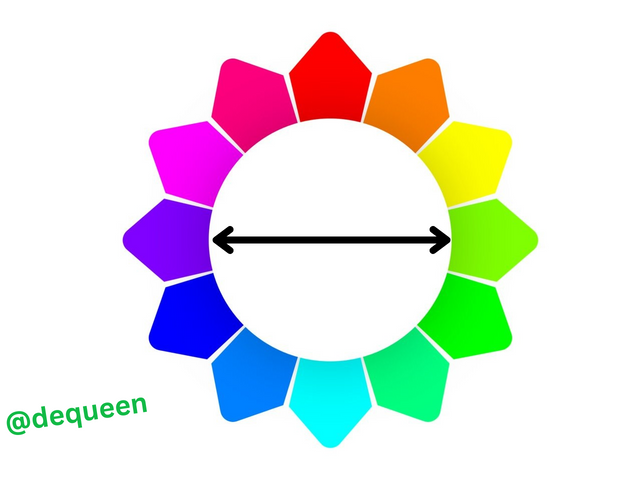
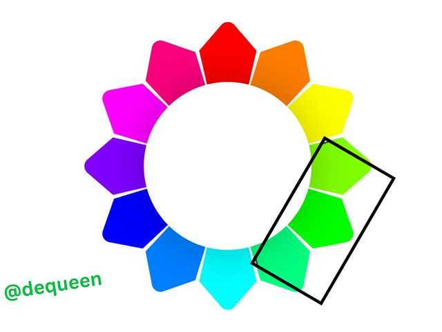
Complementary colour: Literally complementary is often refers to one or more thing that complete or enhance each others betterness. With this in mind complementary colour are those colours opposite to each other in a colour wheel. I noticed that when they faced each other on the wheel , it enhances a strong contract or high contrast when combined together.
In my colour wheel below, you could see that red is directly opposite to Sky Blue and they complement each.
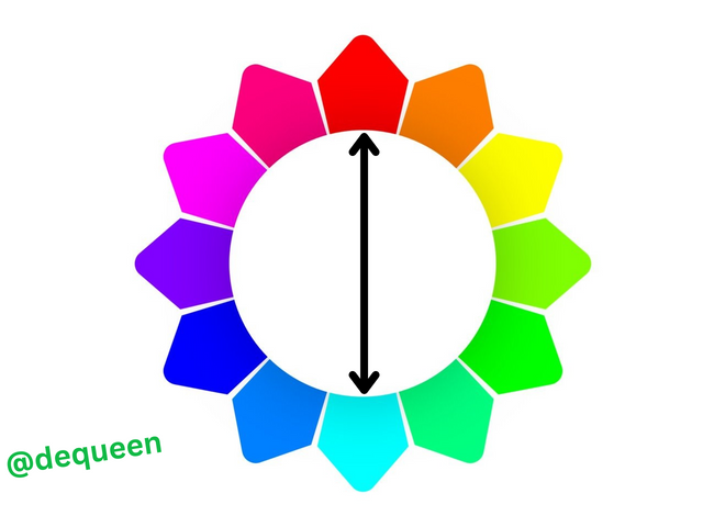
Same with the second wheel purple colour is directly opposite with Green.
2
1
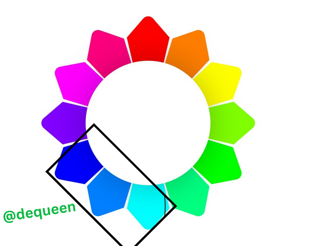
Analogous colors : they are group of three colours that is closely related to each other or that are next inline with each other. In most cases, analogous colour is usually naturally and since it has no harsh contract, they are appealing when we set our eyes on.
l like the scheme of this particular colour because they are easily to located in the same place on every colour wheel.
In my example below they are inside the black box.
1
2
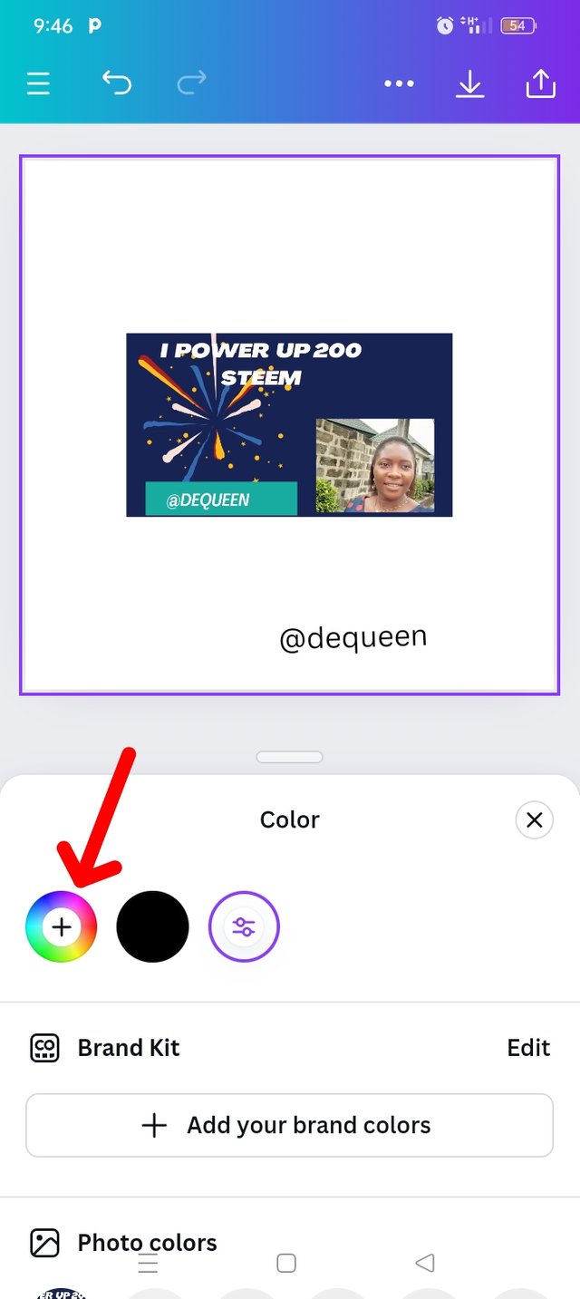
Demonstrate how to get your colour Hex from external object using your Canva design app.
My first step comes with launching or opening of my canvas app and click on the blank page l intend to use.
When l successful getting it, I click on the gallery icon that will take me directly to my internal photo. Within here l can select my colours,
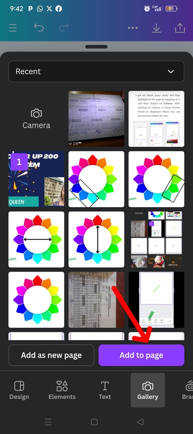
Then l selected a design that I used for contest few months ago. I selected Add to page. Which will lunch me back to our main work space.
| Step 1 | Step 2 | Step 3 |
|---|---|---|
 |  |  |
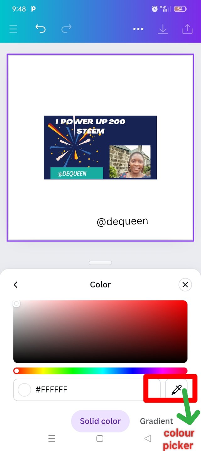
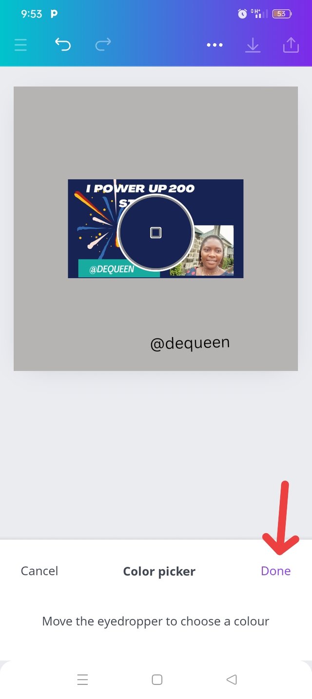
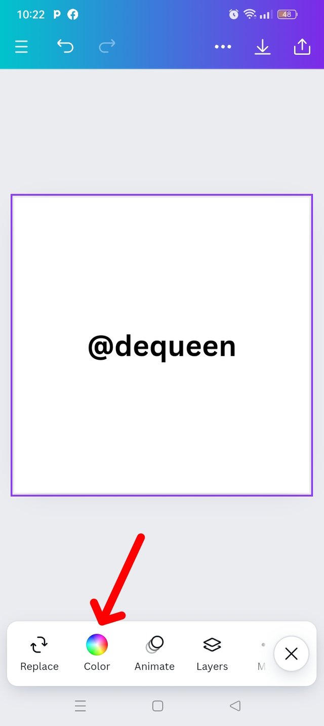
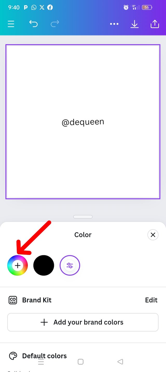
I will click on the icon and select the colour wheel.
The next l did was to select my colour picker.
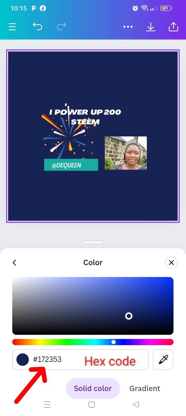
and that helped me picked the colour from the picture to the background, and that's how I got my colours and the Hex code is
#762CR73.
| Step 4 | Step 5 | Step 6 | Step 7 |
|---|---|---|---|
 |  |  |  |
Finally demonstrate how to get the colours behind the hex codes below.
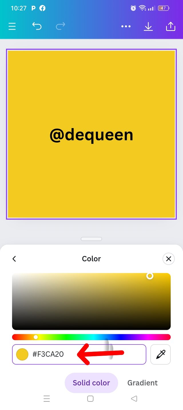
a.#f3ca20
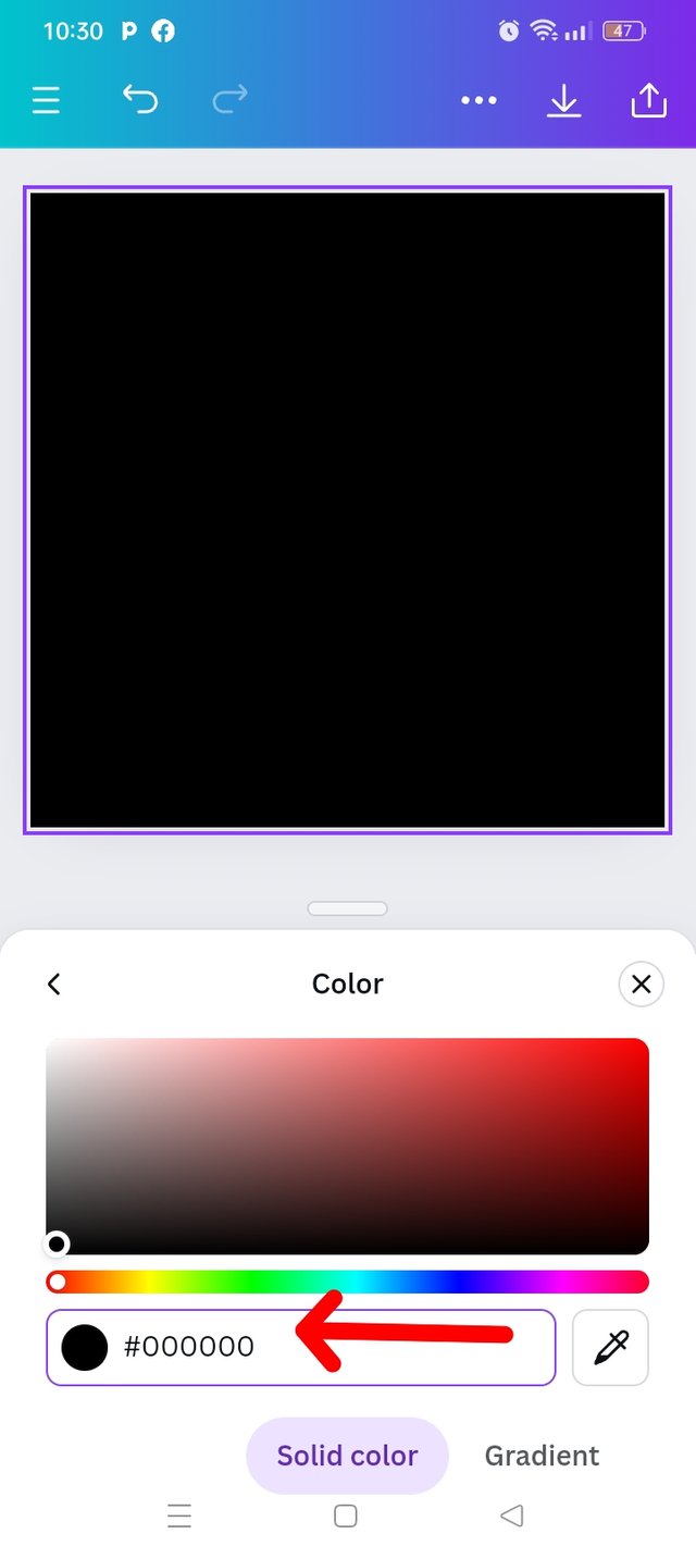
b.#000000
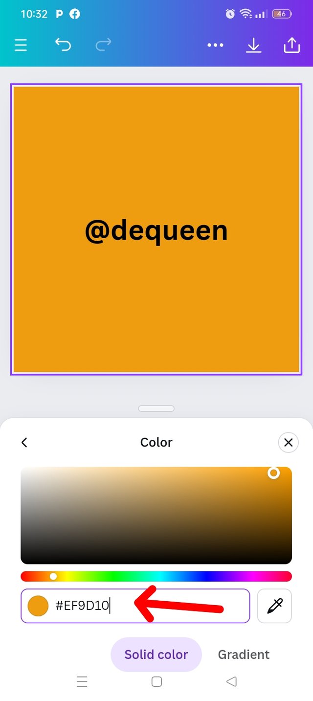
b.#ef9d10f
Open back to your canva app and set up your interface with any sizes of your choice. Then highlight the background and select the color icon.
Check down and click on the colour wheel to select colour.
| Step 1 | Step 2 | Step 3 |
|---|---|---|
 |  | 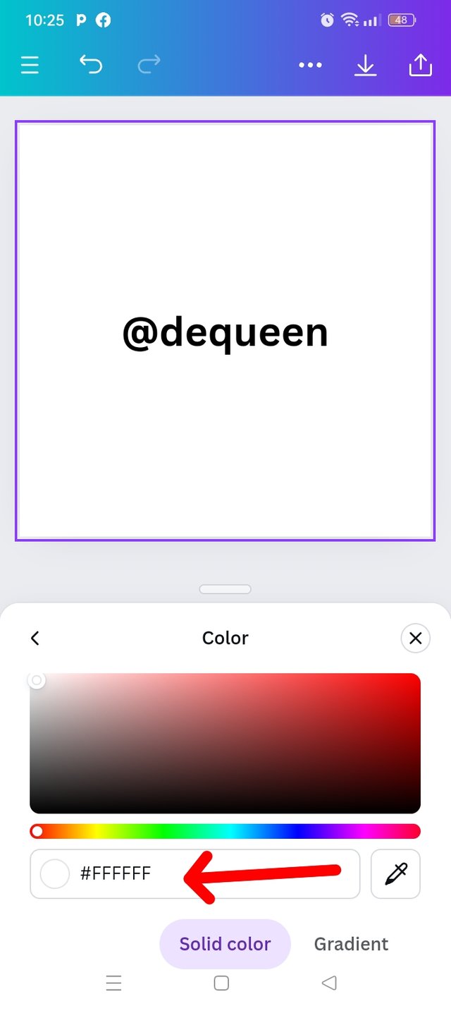 |
I carefully erased the hex code for default white and put in my code #f3ca20 to get the color behind the hex code.
I did the same to the remaining two as Shown below.
| #f3ca20 | #000000 | #ef9d10f |
|---|---|---|
 |  |  |
My special thanks goes to @lhorgic for reminding us of what we learn some years ago about primary, secondary and tertiary colours. I would like to invite #goodybest, @dove11 and @alfazmalek and @alejos7ven to share their entry.
Good to see you join the graphic class by displaying your homework in such a detailed manner. Colors can only appear beautiful when it is being combined well and here, I have seen that creativity and efforts in your work. Well done and many success in the contest!
Thanks so much for great comments, l really appreciate.
@tipu curate
Holisss...
--
This is a manual curation from the @tipU Curation Project.
Upvoted 👌 (Mana: 1/8) Get profit votes with @tipU :)
Hello @dequeen thank you for participating in this week's lesson. We have assessed your entry and we present the result of our assessment below.
Feedback:
• You have clearly defined Colour theory the way you best understand it and I appreciate the effort you put into it.
• Your selection on colour scheme is nice. Good to see that you clearly demonstrated how much you understand the use of those scheme which is quite commendable.
• Finally, Your practical looks really nice in it presentation, looking very organized and comprehensive.In all, you did a good job. I hope you keep up with the energy level. Weldone.
Regards
@lhorgic❤️
This is so good of you, your demonstration is beautiful. Thank you for sharing this knowledge with us. I truly believe that with this training, graphic design is made easy.
Wishing you success 👍