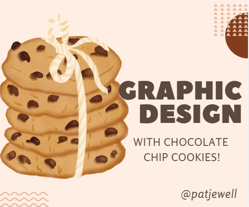
SEC20/WK1: Introduction to Graphic Design and Principles
And here I am! I received so many invites that the temptation was just too much.
I’ve never given the question of what graphic design is much thought.
Now, if I Google the term “graphic design,” Google will come up with the following explanation:.
Graphic design is a craft where professionals create visual content to communicate messages. By applying visual hierarchy and page layout techniques, designers use typography and pictures to meet users’ specific needs and focus on the logic of displaying elements in interactive designs to optimize the user experience.
Now for me, this sounds way too complicated.
If you had asked me this question many years ago, I would have told you that graphic design is the art in which text and images are combined to create an advertisement for magazines, billboards, and television.
Over the years, my viewpoint changed a lot. Let me see how best I can explain it.
Let’s start with looking at the two words:
Graphic:
Umh... Is graphic not visual? Indeed, it is visual, which is associated with imagination, expression, and art. It involves making use of various different mediums, like painting, drawing, and more, to give it more detail. For me, they are those building blocks of a design.
In graphics, we also take different elements like shape, color, texture, lines, space, and typography (written language).
Design:
In the end, we arrange the mediums and elements all in a specific format on a surface to create a “picture” or an idea, and this is where design comes in. This, for me, is how we want our end product to be. In other words, we have to put our thinking caps on and think about the message we want to portray, the problems we want to solve, and the practical side of our creation.
This is where those design principles we’ve learned about—contrast, emphasis, balance, hierarchy, alignment, rhythm, repetition, unity, and white space—come in.
I've learned so much from the use of these principles that I've decided to put them to the test. I decided to design an advertisement and play with it to see which principle will give me the best end result.
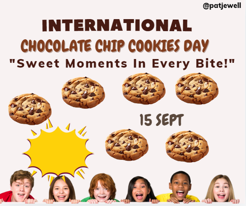
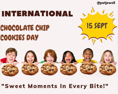
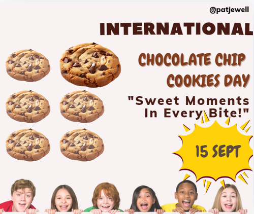
These were the elements I have chosen to be used in my design.
With these elements I put the following principles of graphic design into action.
Principle 1 – Alignment
Definition: Alignment in graphic design describes how the different mediums and elements are arranged in relation to one another and also the overall pattern. This we do by arranging elements in a way that is easy to follow for the eye. The end result must be visually appealing and, let’s not forget, also well-organized.
There are different types of alignment, left, right, center, top, and bottom. Oh yes, let’s not forget "justify,” something we are all familiar with here on Steemit.
After reading about alignment, I had to discover that center alignment is not something commonly used in advertising.
The very first thing I did was to align the text. I aligned it to the left. Next, I decided to align the elements in a row and under each other.
To balance the design, I aligned the date on the right.
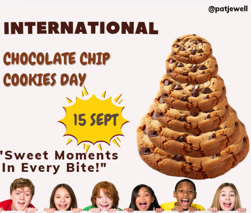
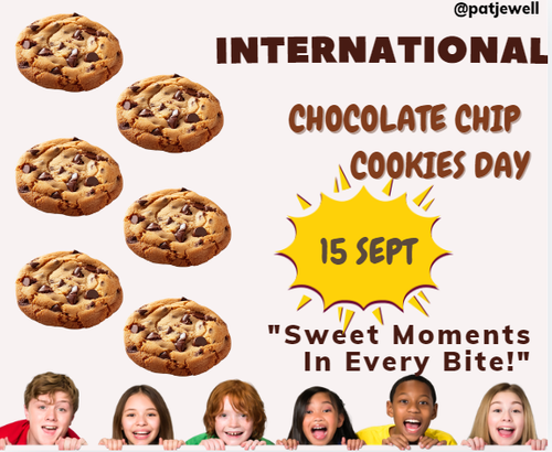
Principle 2 – Hierarchy
Definition: Hierarchy refers to how you arrange and present the elements in such a way that it makes a statement. In other words, it must guide the viewer’s eye to the most important part of what you want to tell them.
As I was happy with the alignment of text plus the most important part of my design was not the text but the chocolate chip cookies, I decided to put hierarchy to the test by arranging the cookies.
To balance the design, I decided to put the cookies on the right and the date on the left. I also made the date a bit smaller.
Was I surprised! The cookies stood out and looked like they were jumping out of the design.
Principle 3 – Emphasis
Definition: Emphasis is also used to draw attention to a particular element or area of your design. It is what you are using to make certain parts stand out more so that they immediately catch the attention.
To put emphasis on the test, I decided to align the text to the right and use transparency to make the elements, except for one cookie, lighter. I also made the one cookie slightly bigger than the others.
Principle 4 – Rhythm
Definition: Rhythm is the flow of the elements, which gives them an organized look and feel. It can also make the design look organized. Using it correctly can lead to engaging the viewer.
I decided to try one more element just to see how I can apply rhythm to the cookies. I was not so sure about if it would work or not.
I left the text aligned to the left, and then I played around with the cookies by placing them in a type of pattern to form a rhythm.
All that remained was to decide which of these principles worked the best for my design. Little do I need to tell you that I could not decide. I was amazed to see how each of the principles had a different effect on the design.
Let me know which design is your favorite.
Over to the last exercise of showing how I made the following design of the original author my own in 5 steps.
Read more
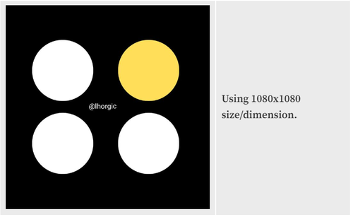
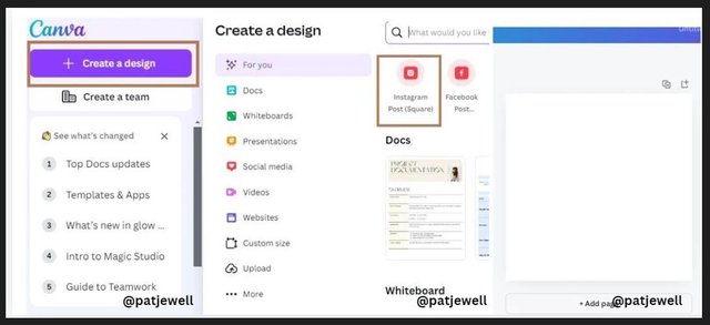
Step 1: I opened Canva on my laptop with the new interface. I then located the plus "+" icon to select size/dimension just as mentioned. In the new interface, it shows as “Instagram Post Square." When you move your mouse over it, you will see the “1080x1080.”
Step 2: Next I changed the color of the page by locating the color on the toolbar. I dragged up the highlighted part (slider) on the second slide to get a variety of colors from which I picked black.
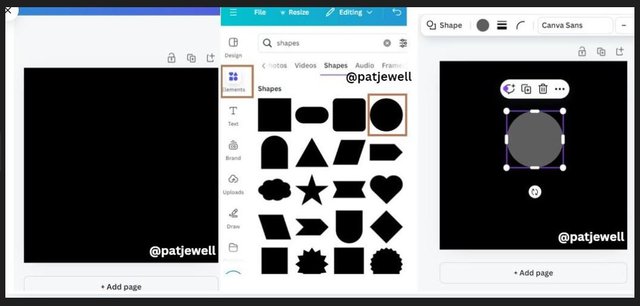
Step 3: I now have a black background, which you can see in the following image. What was left was to choose the element. This I did by clinking on “Elements,” and then on the shape I must use, the circle. By clicking on the circle, it was automatically placed on the page.
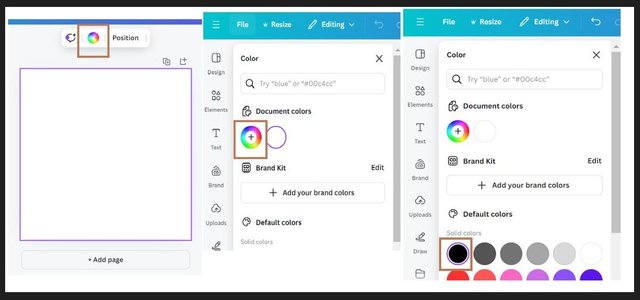
Step 4: According to the guidelines in the main post, I had to change the color of the circle to white. I click on the color wheel in the toolbar above the page, which opens the color interface on the left-hand side of my screen. I then clicked on "white,” which changed the color of the circle to white.
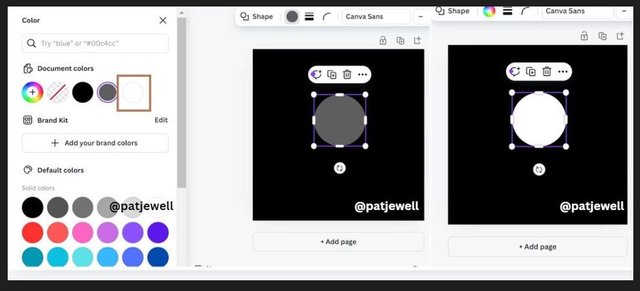
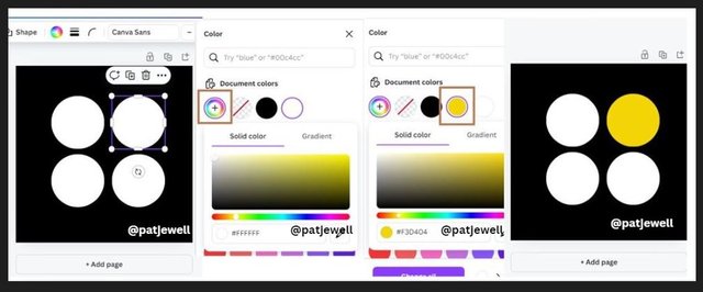
Step 5: Lastly, I duplicated the circles by clicking on the + icon until there were four of them. I then arranged the circles neatly in a pattern and then chose the color I wanted to use to highlight one of the circles. This I did by clicking on the circle I want to use, then clicking on the color wheel in the toolbar, which opened the document colors from where I went to the color wheel itself and clicked on the yellow I wanted to use. This left me with the required image.
I don't know about you but I cannot wait for the next few lessons!
I invite @mini80, @fantvwiki, and @ifatniza to take part in this contest

Making graphic designs is both easy and difficult. If I am asked to do it, God willing, I can do it, but if I am asked to explain it, I will be confused. But I salute Mrs. Patjewell for being able to explain clearly. May you be successful, Ma'am.
0.00 SBD,
0.15 STEEM,
0.15 SP,
0.00 TRX
Hello, my friend!
Thank you for the visit and the comment.
Don't underestimate yourself. I can still remember your teaching lessons and how I enjoyed them. (•ิ‿•ิ)
🫰
Your post has been rewarded by the Seven Team.
Support partner witnesses
We are the hope!
0.00 SBD,
0.15 STEEM,
0.15 SP,
0.00 TRX
Thank you!
ThankGod, I visited your post today, i learned something new about graphic design. The way you took your time to break down the explanations on alignment, hierarchy, emphasis and rhythm made it clear on how each of this principle affects the entire design
0.00 SBD,
0.15 STEEM,
0.15 SP,
0.00 TRX
Oh man! Did I enjoy this lesson. I myself learned such a lot from it. Okay, it took me nearly a day playing around with what I have learned, but in the end it was worth it.
This week's lesson is just as interesting. I hope I am going to see you participating. I am not going to miss it.
Here is the link;
https://steemit.com/hive-147599/@lhorgic/sec20-wk2-colour-theory-and-application
0.00 SBD,
0.02 STEEM,
0.02 SP,
0.00 TRX
Hello @patjewell thank you for participating in this week's lesson. We have assessed your entry and we present the result of our assessment below.
Feedback:
• You have clearly defined Graphic design the way you best understand it and I appreciate the remarkable effort you put into it. Your definition shows you took time to digest what graphic design is as a concept.
• Your selection on the principles of design is nice coupled with your comprehensive explanation.It's cool to see that you used corresponding visual of these principle to explain your points, and trust me, I was completely swept off my feet seeing how you practically applied these principles, it was as though you peep into what we were going to learn in weeks to come. I really commend your effort.
• Finally, Your practical looks really nice in it presentation, as you have clearly
shown how you transitioned from one stage to the other. In all, you did a good job. I hope you keep up with the energy level. Weldone.
Regards
@lhorgic❤️
0.00 SBD,
0.15 STEEM,
0.15 SP,
0.00 TRX
Good morning!
What a nice comment to wake up to. Thank you!
I can tell you one thing, you kept me busy for nearly a day BUT it was worth it as I have learned so much.
I once again learned a lot about graphic design. This post explained the rules in detail and tried to explain each topic.
0.00 SBD,
0.14 STEEM,
0.14 SP,
0.00 TRX
Thank you for the visit and the comment. ☕
It is amazing how we can learn from these engagement posts.
Let's see what we can do with this week's lesson.
I hope I am going to see our participation.
Terima kasih Bu o
Patjewell atas penjelasannya yang sangat informatif dan detail. Setelah saya baca seperti nya mudah dipahami saya akan mencobanya, mudah-mudahan saya bisa.
0.00 SBD,
0.14 STEEM,
0.14 SP,
0.00 TRX
Thanks for the visit, my friend. 🎕
I have learned so much from this lesson, and I am glad that my post could also help you.
I hope I am going to see your entry in this week's contest. I cannot wait to learn how we can use colors to their best.
0.00 SBD,
0.00 STEEM,
0.00 SP,
0.00 TRX
Terima kasih juga atas ilmunya👍👍
0.00 SBD,
0.14 STEEM,
0.14 SP,
0.00 TRX
Elements for your graphic design, this is what it should look like.. and that's what you are with all the creativity you have.
And again I learn by looking at this, success to you Mrs. @patjewell.
0.00 SBD,
0.14 STEEM,
0.14 SP,
0.00 TRX
Awh, thank you! Not only for the visit but also for the kind words. ☕
This is how we all learn, my friend.
I know you are good with graphic design. The images you create for your posts are always very entertaining.
PS: Big hugs for that lovely daughter of yours.
Upvoted. Thank You for sending some of your rewards to @null. It will make Steem stronger.
@shiftitamanna
Thank you! 🎕
Manejas el concepto del diseño con maestría, el uso de las palabras y el ejemplo adecuado para darse a entender es genial. Es un arte visual y me parece que haces un gran aporte en la explicación de los principios de alguien con experiencia en negocios.
¡Gracias por compartir, mucha suerte y éxitos!
Thank you for the kind words and yes, also for the invitation.
I enjoyed this lesson it was amazing to see the end result with each try.
I think we are going to be "qualified" graphic designers by the end of the six weeks.
Best wishes for this week's contest!