"SEC20/WK1: Introduction to Graphic Design and Principles."
 |
|---|
What usually attracts people's attention to an advert or content is how the image that is used is been designed. Graphic design is important as it is a piece of colors, image layout and so on that is used to convey information. Right here in this, graphic design is what I have talked about based on what I have learned in the lesson given by @lhorgic
Question 1: What is Graphic Design?
Briefly Share with me your understanding of graphic design
The act and practice of creating visual content to communicate messages to people is what graphic design simply means. For example, here on the Steemit platform we usually use typography, color images, and layout techniques to craft pieces that evoke emotions or convey information to our audiences. Graphic design is applied across various media, including media advertising, promotion, social media, website, product packaging, and so on.
The purpose of graphic design is to beautify and make content visually appealing, and effective in delivering information to its audience. As it is today, almost everyone here on the Steemit platform and outside the Steemit platform practices some form of graphic design in their daily life, be it adding text to an image for a Steemit post, social media, or editing an already designed image, you're practicing some of digital design which is spans across several disciplines.
Question 2: Pick any three of the principles of Graphic design and talk about them based on your level of understanding.
Whether you are a graphic designer or intend to become a graphic designer, it is good for you to master the principles of graphic design, as it is a guideline that you need for creating effective and a well presentable design. Below is an overview of the three principles of graphic design that I have talked about based on my level of understanding.
Hierarchy
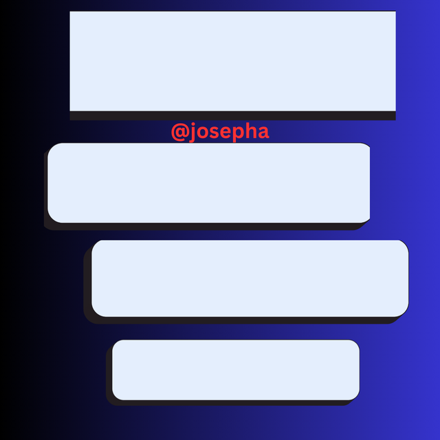
The most common mistake that people make when designing an image is the mistake of not arranging the elements or content in a way that signifies their importance. Having said so, Hierarchy simply means the arrangements of elements to signify their importance. This can be done by adjusting size, position, or color which can make viewers comprehend the important part of your design.
 |  |
|---|
By looking at the images above, you will see that the one on the left-hand side has no hierarchy which is why it doesn't look nice, whereas the right-hand image looks nice after I have applied this principle. To this, it is important to know that larger border elements attract attention first, followed by lighter or smaller elements.
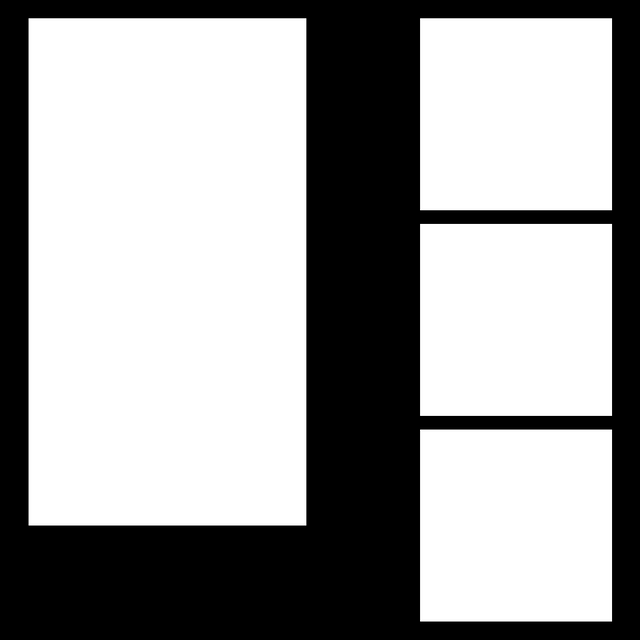
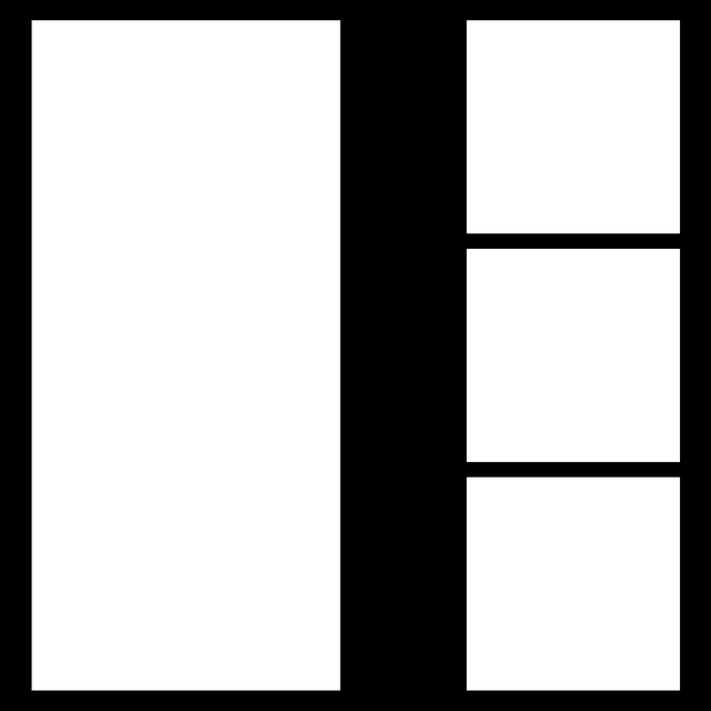
Alignment
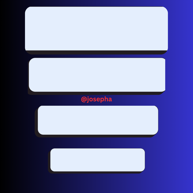
These are the principles that we have to follow to ensure that we place our elements in an organized way, that will create more sense of order and coherence in our work. Using proper alignments can make our design look professional, beautiful, and clean. Whether right-centered or left-aligned, applying this principle of alignment whenever we are designing can help us to create a well visual connection between elements.
 |  |
|---|
For example, by mainly looking at the image above, you will see that the one on the left-hand side has no alignment which is why it doesn't look nice, whereas the right-hand image looks nice after I have applied this principle.
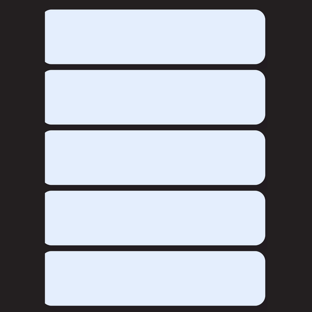
Balance
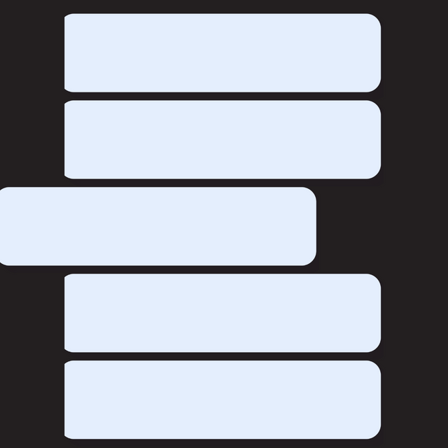
These are the principles of graphic design that deal with the distribution of visual elements in a design creating harmony and stability. There are two main types of balance which we have: the symmetrical balance and the asymmetrical balance.
 |  |
|---|
For example, by mainly looking at the image above, you will see that the one on the left-hand side has no balance which is why it doesn't look equal, whereas the right-hand image looks nice after I have applied this principle.
Question 3: Practically show us how to make the graphical image below.
In this section, I will be showing you how to make a graphical image by showing you all the steps that are required for making a simple graphic image. Without further ado, let's get started immediately.
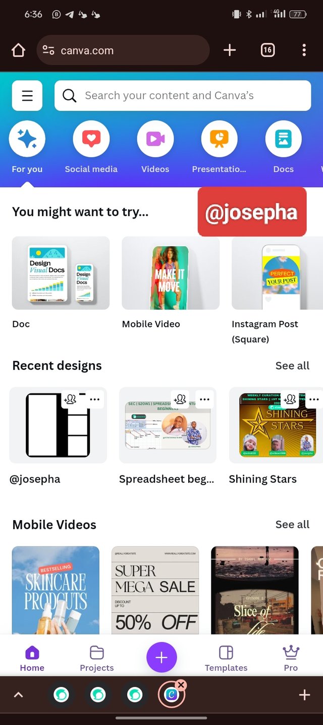
- Step 1: I Launch my Canva web version, and locate the plus "+" icon which I click on it and then select size/dimension as Instagram 1080x1080.
 |  |  |
|---|
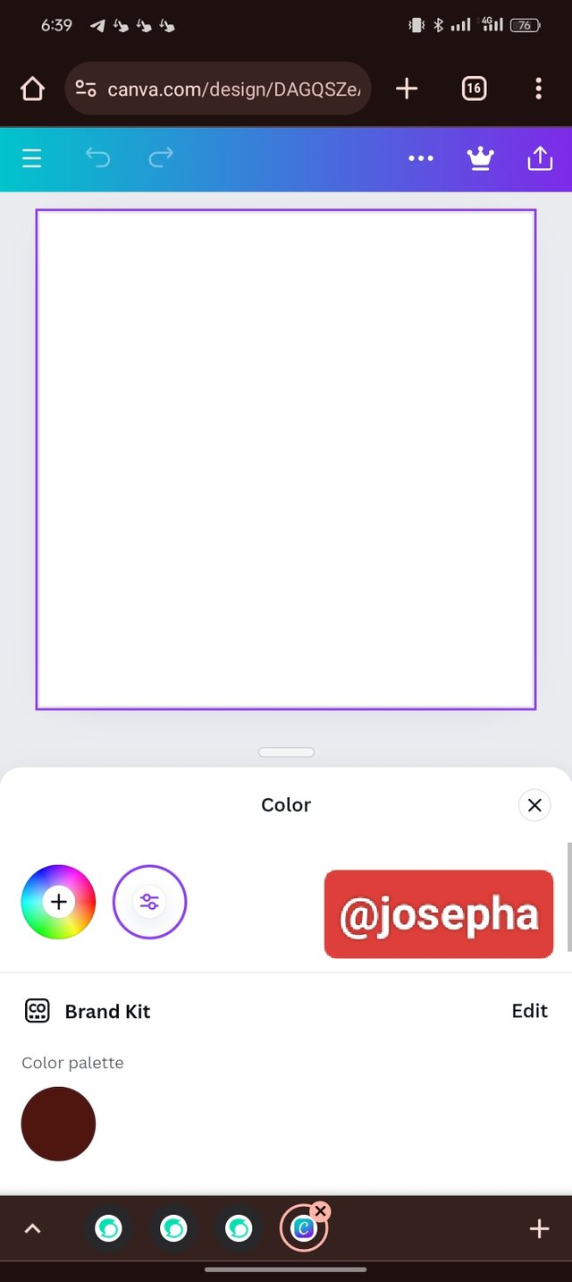
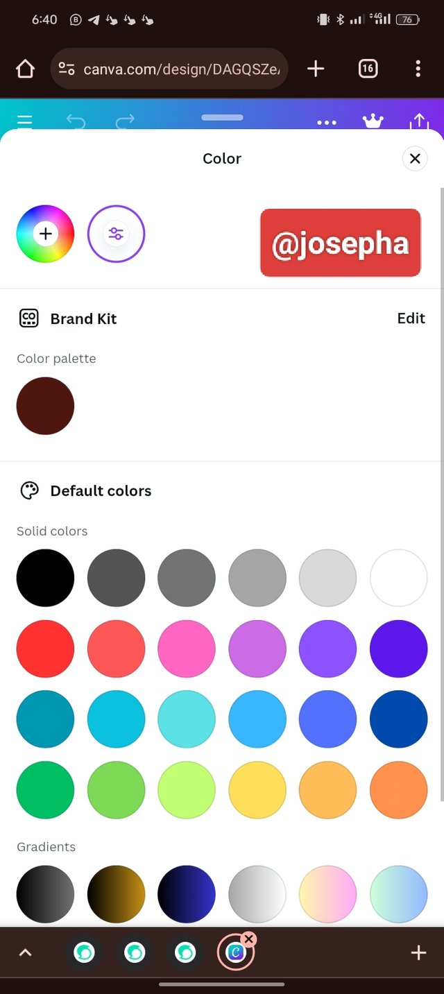
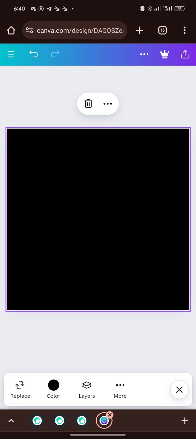
- Step 2: In this step, I changed the color by locating the color icon on the toolbar. I dragged up the highlighted part (slider) on the second slide to get different colors from which I picked a black
 |  |  |
|---|
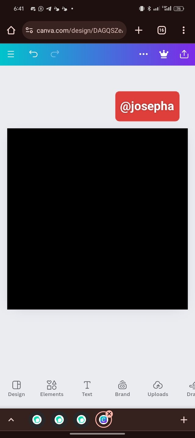
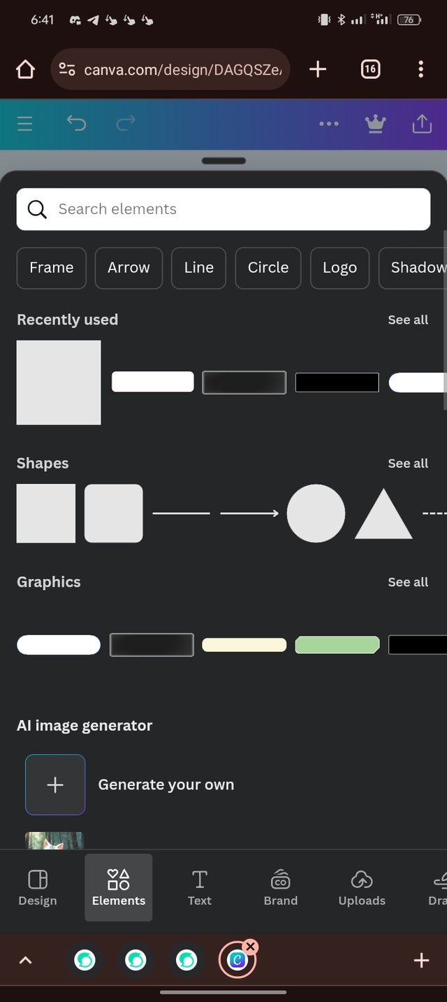
- Step 3: From the images I have shared so far, you can see that the background is now black. Next is to bring in our shape (circle) which I click on the element. In your own should in case you don't see the circle that you need, you can use the search bar and search for it.
 |  |  |
|---|
- Step 4: Now you can see I have the circle shape on my background. The next thing I did was to change the color.
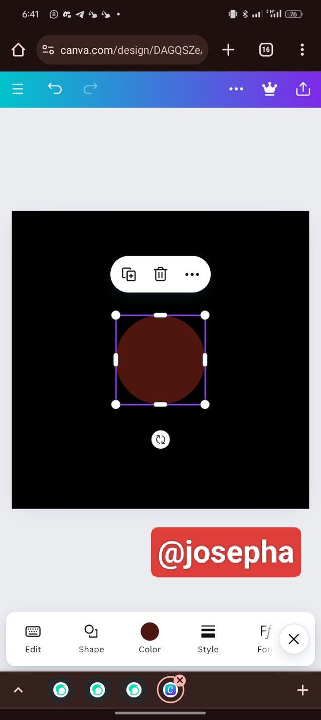 | 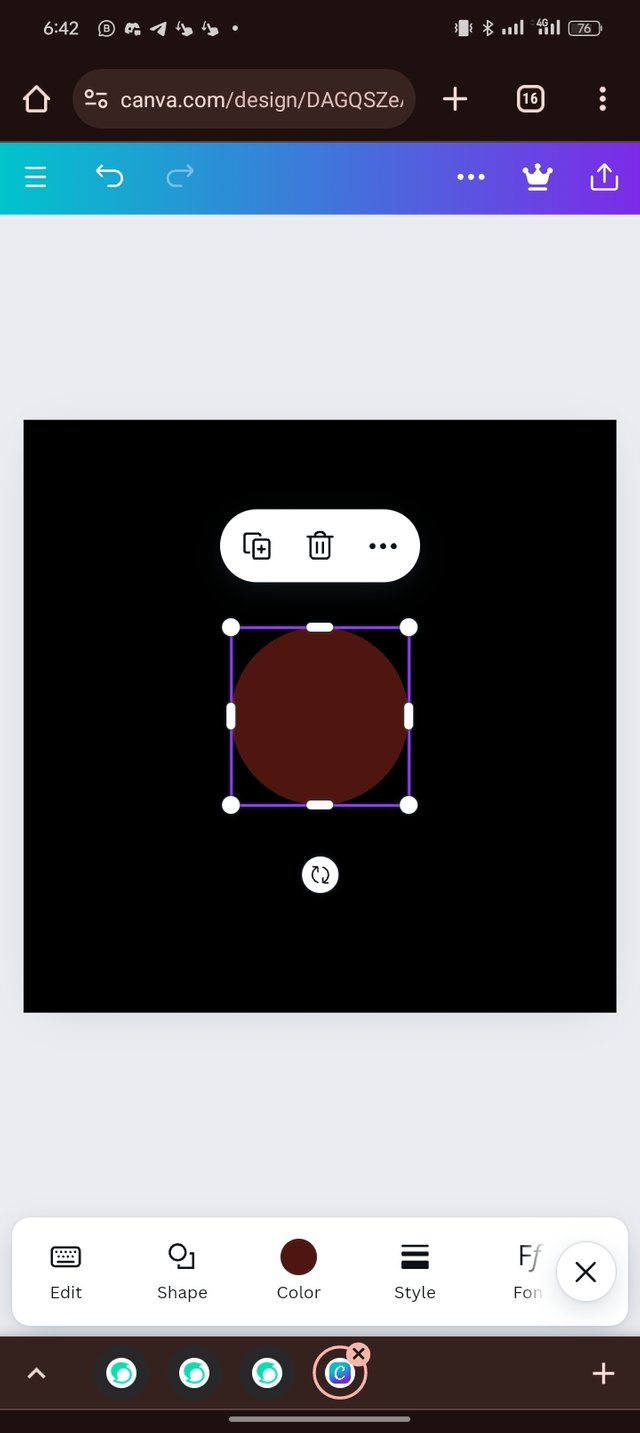 | 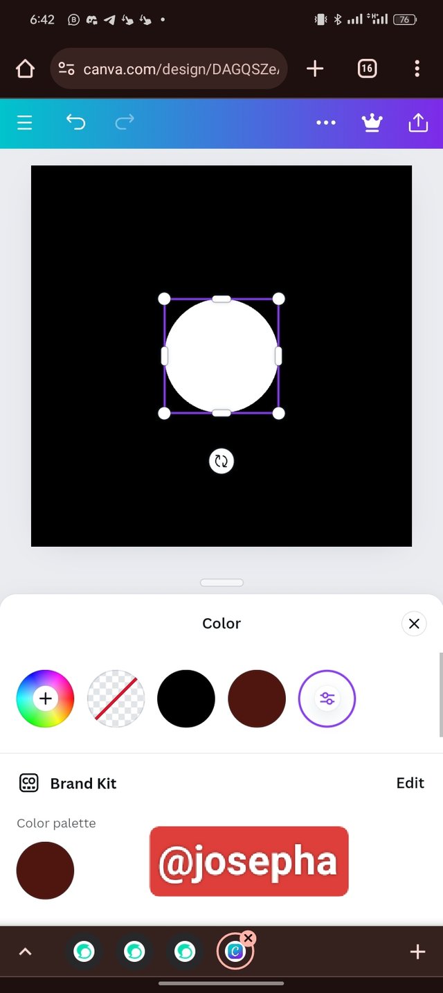 |
|---|
- Step 5: Now I have applied a circle shape in white on the design. The next thing that I did was I clicked on the boxed + icon 4 times for the circle to be duplicated into four circles which I then arranged in placed each of them in the position that I wanted. I applied the principles of alignment while arranging the circles.
| 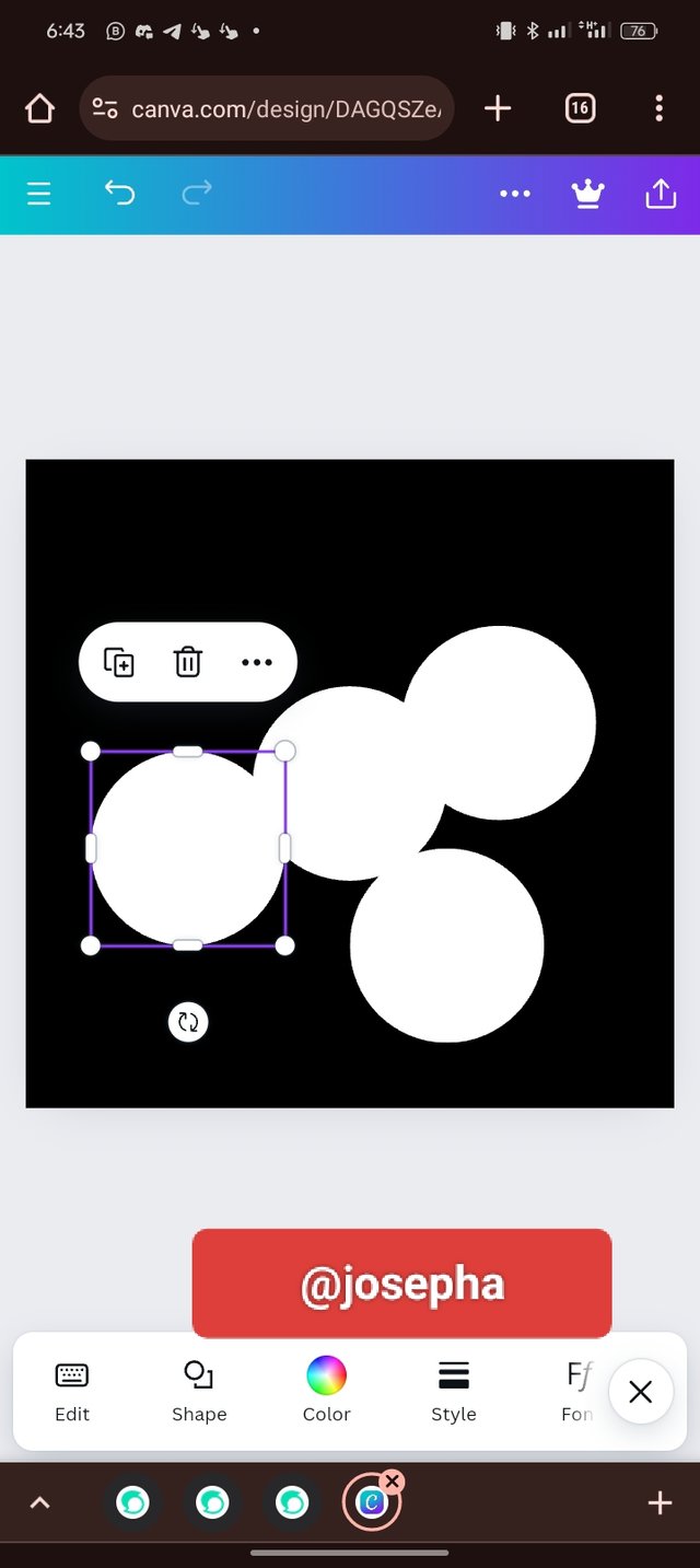 | 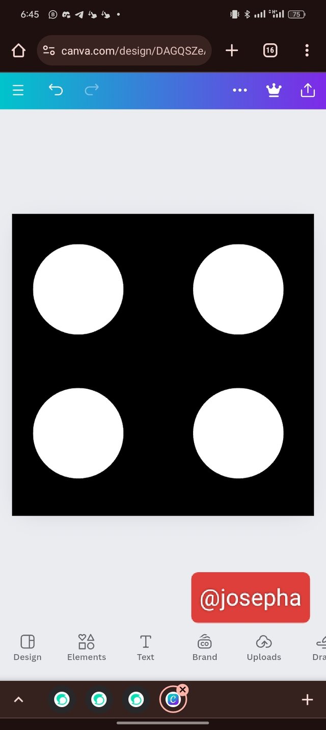 |
|---|
Now, as you can I have successfully created the graphical image that we are been asked to create in the assignment using five (5) simple steps.
Note: All images used in this post, are all designed by me using canvas.
I am inviting: @pelon53, @dove11, @simonnwigwe, and @ruthjoe
Hola mi querido amigo @josepha, un placer saludarte
Excelente trabajo amigo, me pareció que cuídaste todos los detalles para realizar un excelente diseño, y nos dejaste cada ejemplo de los principios del diseño que nos permiten tener un concepto claro de lo que se refieren, y ese paso a paso de como llegar al producto final con la implementacion de la app Canva como lo exigía la tarea pedida por el profesor.
Te felicito por tu excelente desempeño. Un abrazo 🤗
Thanks for your support.
Hello @josepha, thank you for participating in this week's lesson. We have assessed your entry and we present the result of our assessment below.
Feedback:
• You have clearly defined Graphic design the way you best understand it, and I appreciate the fact that you your time to delve even deeper. That's quite commendable
• Your selection on the principles of design is thoughtful. Balance, alignment and hierarchy are core principle... not only did you explain them, you also gave a visual representation of those principles just as you were taught, kudos to you
• Finally, your practical is quite detailed and comprehensive, your final result also mirrors what
Regards
@lhorgic❤️
I will keep this post safe and learn the finer points when free. Thanks for inviting me as my current app on MS is about to disappear from MS Office so I will need it.
No, you don't need MS Office for graphic design. There are several tools such as; Mokker, canvas, Midjourney, etc that you can use for graphic design
Yes, I will have to opt for one of them now.
Go for canvas.
Upvoted. Thank You for sending some of your rewards to @null. It will make Steem stronger.
TEAM 5
Dear participant,
participated in this graphic design contest and your article is very beautiful. Thank you very much.
Thank you for your support.
My dear most welcome.