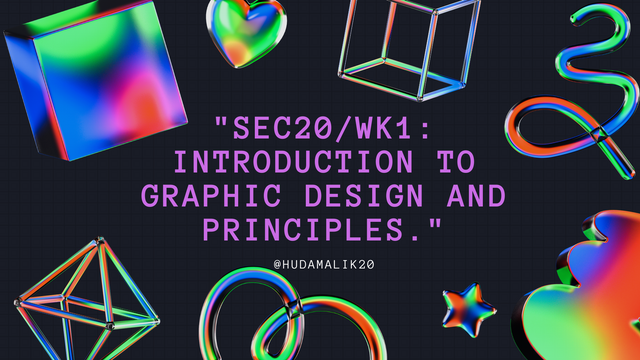
"SEC20/WK1: Introduction to Graphic Design and Principles."
I’m excited to take part in the "SEC20/WK1: Introduction to Graphic Design and Principles"contest organized by @lhorgic. It’s a great chance for me to explore graphic design and try something new. I’m looking forward to seeing what everyone creates and learning along the way.So let's start.

Question 1: What is Graphic Design?
Briefly Share with me your understanding about graphic design.
In my understanding, graphic design is a creative process that blends art and technology to visually communicate ideas. It involves using elements like images, colors, typography, and layouts to create designs that convey a message or represent a brand. Through graphic design, businesses and individuals can make their concepts more engaging and memorable to their audience.
For example, when a company designs its logo, it’s not just an image but a reflection of its brand identity. People recognize and relate to that logo, and it becomes a way for the business to communicate with its customers without using words. Graphic design is essential in areas like marketing, advertising, and even personal projects such as invitations or business cards.
Many brands use graphic design to create logos, banners, and promotional materials that represent their identity.In today’s digital world, graphic design is everywhere, from websites and apps to social media posts. As more aspects of life move online, the importance of visually appealing designs has grown, helping businesses connect with their customers and stand out in competitive markets.
Question 2: Pick any three of the principles of Graphic design and talk about them based on your level of understanding .
Contrast:
In my understanding, contrast is about making different elements in a design stand out, ensuring the viewer's attention is directed toward important areas. It improves user interaction by making designs more visually appealing and easier to read. For instance, when a background is dark, like black, it’s best to use a contrasting light color for the text, such as white or light gray. This creates a clear separation between the elements, making the content easier to read.
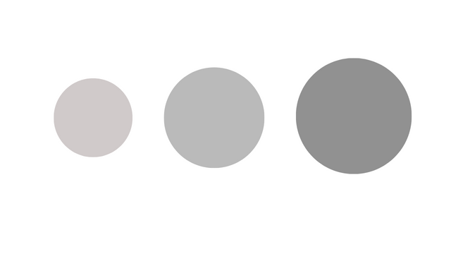
Contrast can be achieved not only through colors but also through shapes and sizes. For example, a design might use a dark purple background with light blue text to create a visual balance. By making smart choices with contrasting colors and shapes, a designer can ensure that their work is visually engaging and user-friendly, enhancing both aesthetics and functionality.
Alignment:
In my understanding, alignment is about arranging elements in a design, such as text or images, in a way that creates a sense of order and visual appeal. When writing text, for example, it's important to ensure that the text follows a consistent horizontal or vertical line, with equal spacing between lines or elements. This makes the design look cleaner and more organized, which makes it easier for the user to read and interact with.
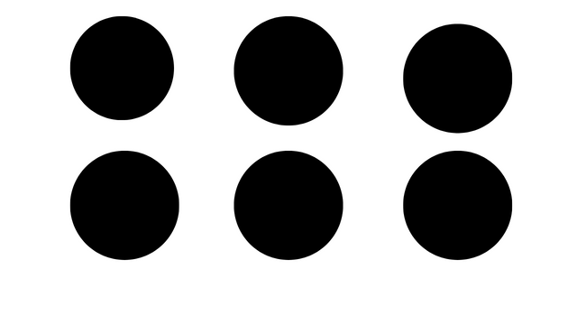
For example, if we’re creating a logo or key element on a webpage, it should be aligned properly whether centered or aligned to the top or sides so that the user’s eyes naturally focus on it. If the main message of a webpage is aligned at the top center, it ensures that the user’s attention is drawn to it first, making the design more effective.
Emphasis:
In my understanding, emphasis is used to make certain elements in a design stand out, so they grab the user’s attention first. This can be done by changing the font size, making the text bold, or altering its color. For example, when reading a paragraph, if some key words are bold or have a different color, the user’s attention is immediately drawn to them. This helps highlight the most important parts of the content.
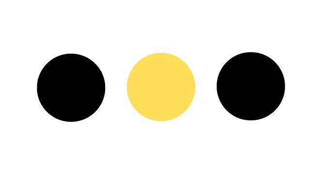
Similarly, in designs that involve shapes or other graphic elements, one element can be emphasized by using a different color or making it larger than the others. This technique is also used in the contest design we're discussing. By changing the color or style of one shape or word in a paragraph, the designer ensures that the viewer's focus is directed where it's most important.
Question 3: Practically show us how to make the graphical image below.
For this task, where we were asked to recreate a specific graphic design, I decided to use the Canva app that I already had on my mobile. Here's how I completed the process:
First, I opened the Canva app, which I had already downloaded. As soon as the home page appeared, I tapped the plus sign located at the bottom center.
 |  |
|---|
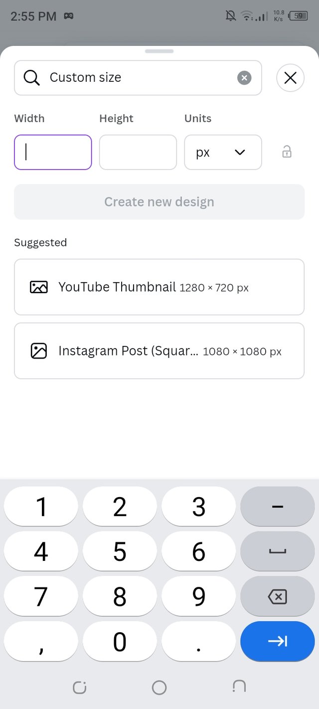
After clicking the plus sign, I saw several design templates that were available. I went with the "Custom Design" option and selected the Instagram format with the size 1080x1080 pixels, which was mentioned in the assignment.
 |  |
|---|
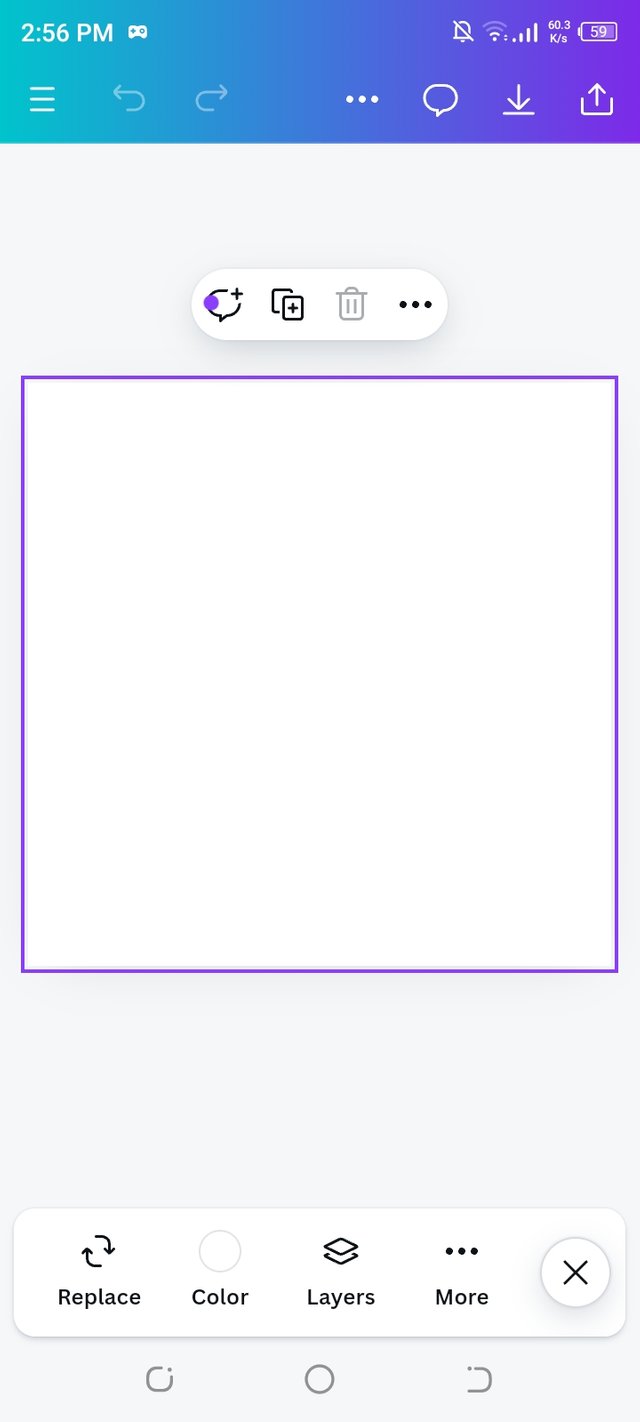
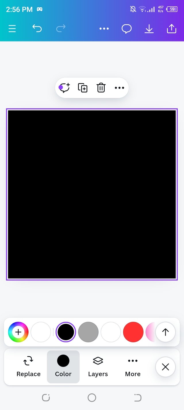
Once the blank page appeared, it had a default white background. I changed the background color to black to match the style I wanted for the design.
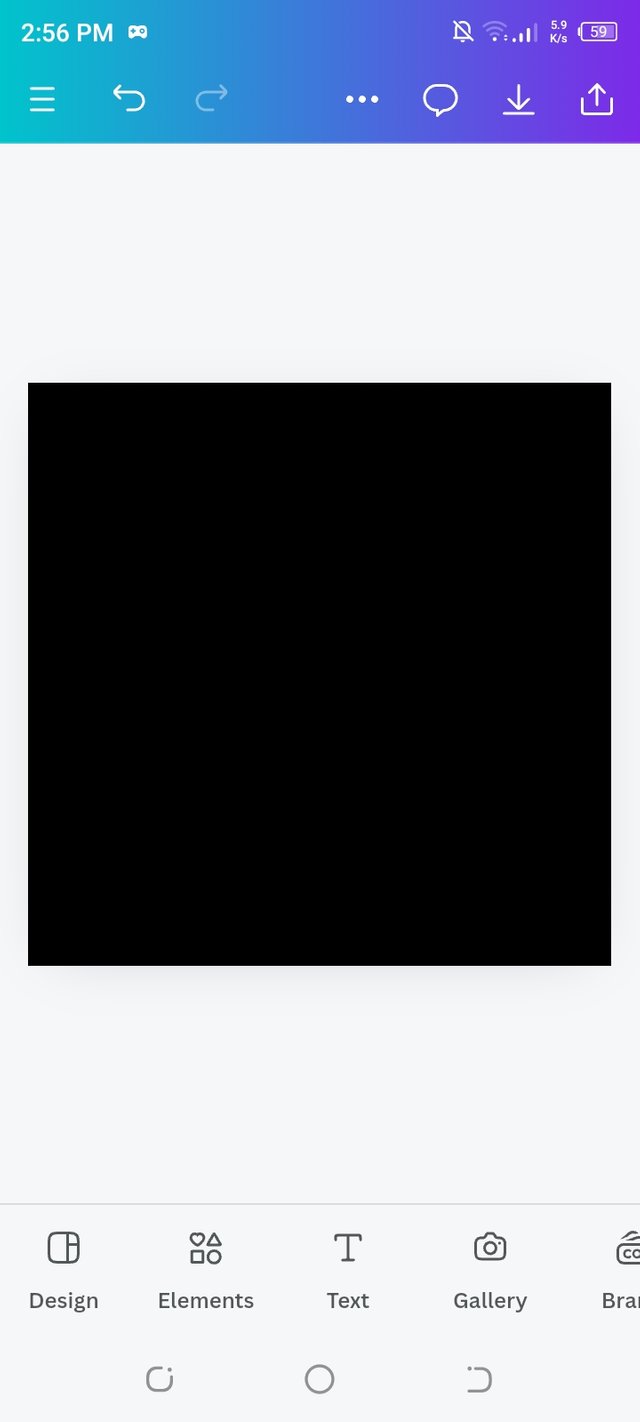 |  |
|---|
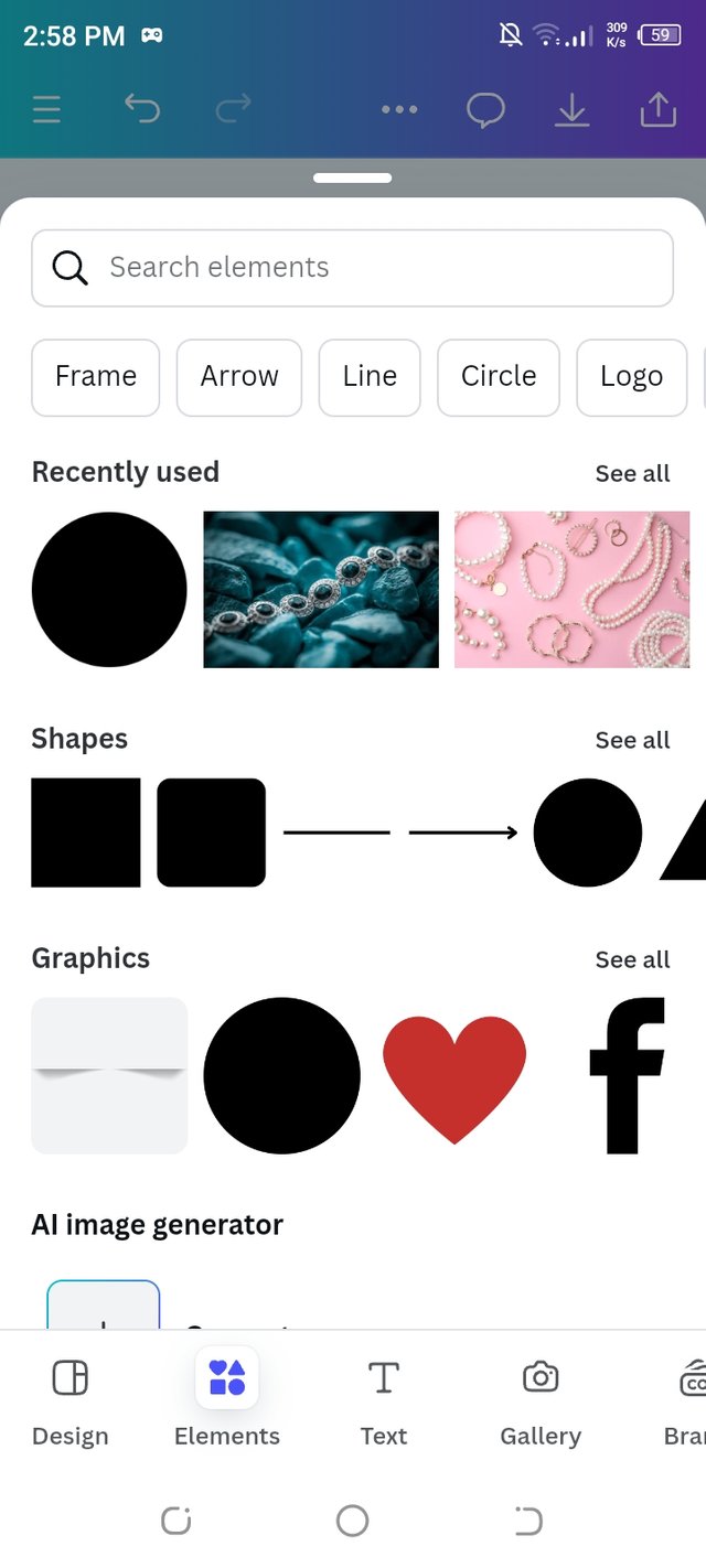
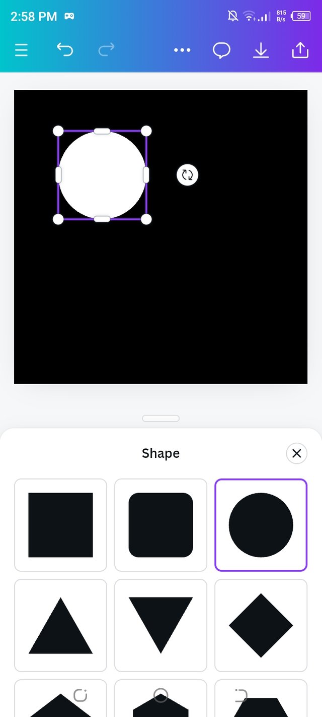
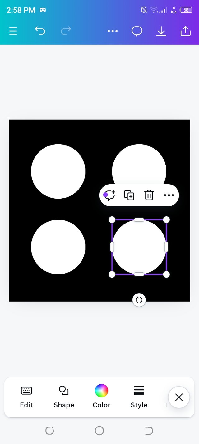
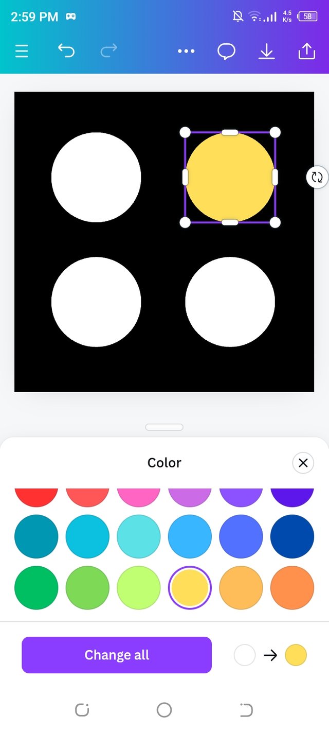
Next, I clicked on the "Elements" tab, which had a variety of shapes. I picked a circle and placed it on the canvas. After that, I changed the color of the circle to white. I repeated the process to add a total of four circles and arranged them in a square pattern.
 |  |  |
|---|
I colored the right-side circle yellow. I added my username in the center of the design.
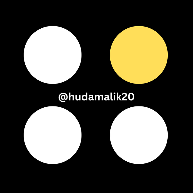
I completed the assignment by following these steps. This was my first experience designing from scratch using Canva, as I usually work with pre existing designs. I found the course extremely valuable and educational, and I gained a lot of knowledge from this hands on experience.
That's it from today's blog I hope you will like it. With best wishes ❤️. Now I like to invite @tammanna, @mile16 and @sualeha to participate in this amazing contest.
Thanks alot for reading ❤️🤗 .
Upvoted. Thank You for sending some of your rewards to @null. It will make Steem stronger.
Hello @hudamalik20 thank you for participating in this week's lesson. We have assessed your entry and we present the result of our assessment below.
Feedback:
• You have clearly defined Graphic design the way you best understand it and I appreciate the effort you put into it.
• Your selection on the principles of design is nice coupled with your comprehensive explanation.It cool to see that you used corresponding visual of these principle to explain your points which is quite commendable.
• Finally, Your practical looks really nice in it presentation, but then something is lacking, you didn't use your mark up tool to clearly highlight the key areas that showed how you were transiting from one step to the other. In all, you did a good job. I hope you keep up with the energy level. Weldone.
Regards
@lhorgic❤️
Thank you so much for your kind feedback.I'm happy you liked my explanation and the visuals I used. I will make sure to use the markup tool to highlight key areas better next time. Your advice will help me improve, and grateful for the score and support. I’ll keep working hard 🤗💞🌼💐