SEC20/WK1: Introduction to Graphic Design and Principles.
AssalamuAlaikum & Greetings Everyone!
It's me @amjadsharif
From #pakistan
AssalamuAlaikum & Greetings Everyone!
It's me @amjadsharif
From #pakistan
This course is very wonderful when I studied. It was interesting to me that I could gain some knowledge from him. It will be my honor to be a part of learning this course.
Question 1: What is Graphic Design?
Briefly Share with me your understanding about graphic design
Graphic design is a form of visual content that makes it easy to convey a message to people. It uses fonts, images, colors and other visual elements to make the message attractive and present effectively. It is a way of providing information to people in a visual way.
Graphic design is currently being used in many fields, including advertising, websites, social media or print materials, to capture the attention of the audience, to present information with the help of graphic design.
There are some basic principles of graphic design such as balance, color harmony and proportion.
Design can be made visually beautiful and effective through these same principles.It is important for a graphic designer to choose the right colors, fonts and images. It should be proficient on different software. One who understands the needs of the users and designs accordingly.
These are the elements that make graphic design an important and interesting art, which is necessary and useful in various fields.
Question 2: Pick any three of the principles of Graphic design and talk about them based on your level of understanding
Several graphic design principles have been discussed in the lecture, but I would like to discuss these three here. Balance, Contrast and Alignment. Which are explained in a simple and professional manner.
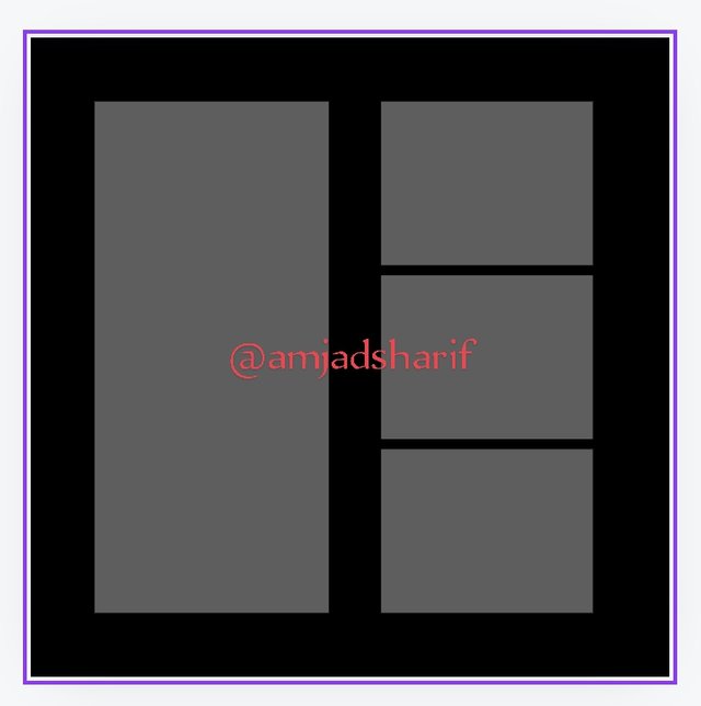
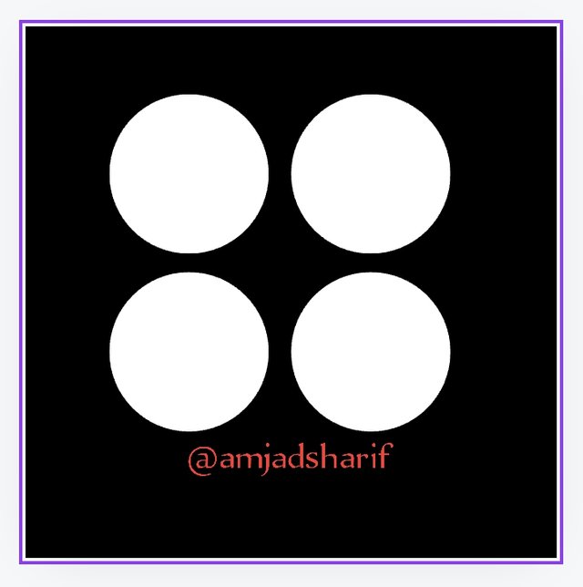
Ballance
Balance in graphic design refers to the distribution of visual elements, these elements are uniformly contrasted and balanced. A balanced design looks stable and aesthetically pleasing. which leads the viewer naturally to the content. There should be no part of the design that feels too heavy or too light and the whole is out of balance.
 |  |
|---|
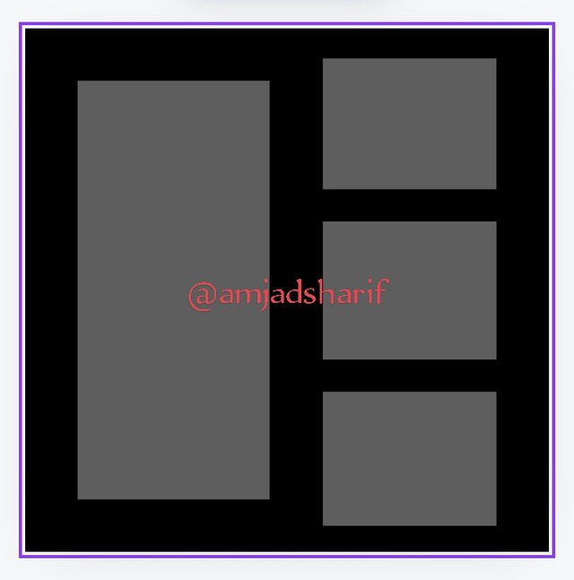
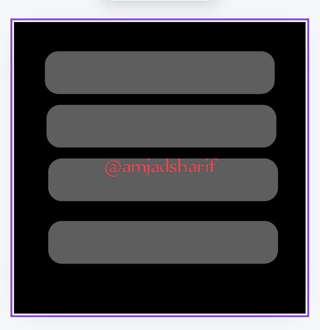
Contrast
This means creating a lot of interest and ranking in the design. It makes elements stand out by using different colors, shapes, sizes, and fonts. An excess of contrast is used to highlight important information or draw attention to specific areas. While low contrast creates a soft and balanced look. Contrast, if used properly, can add charm to a design and help convey a message clearly.
 |  |
|---|
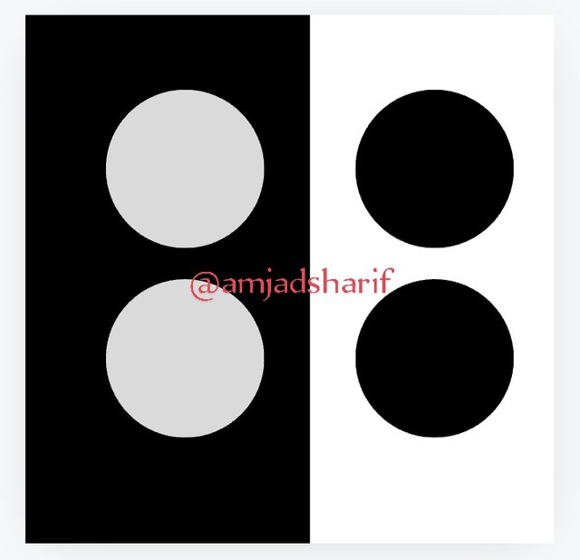
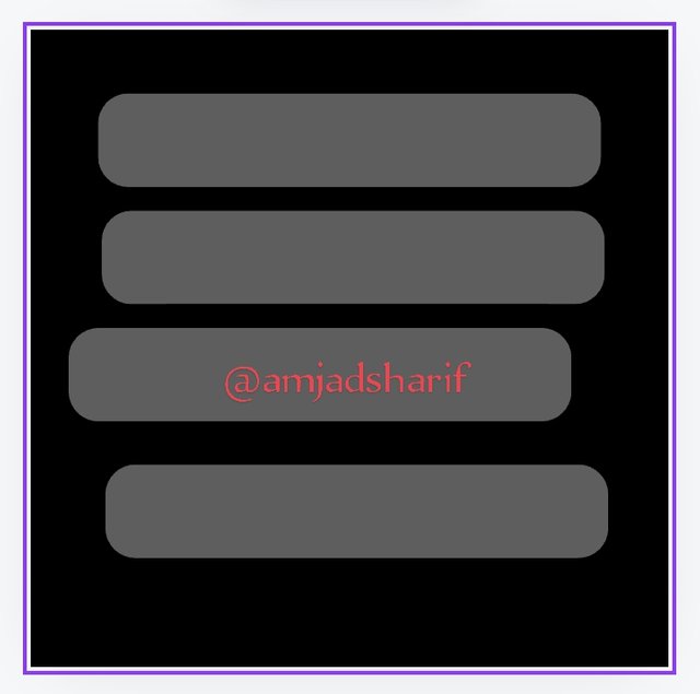
Alignment
Alignment refers to the relative arrangement of elements within a design. It helps create order and organization, making content easier to read and understand. Correct use of alignment Text, images, and other elements are visually coordinated. This creates demand and makes the design clean and professional to improve the viewer experience.
These principles are fundamental to creating an effective and heartfelt design.
 |  |
|---|
Question 3: Practically show us how to make the graphical image below
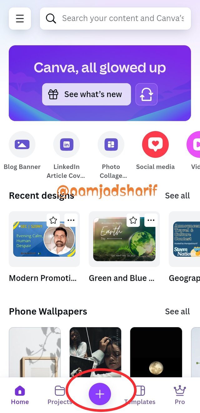
Section of this question I will show you practically, how can we make graphic design or image, using Canva application on mobile or it can be made too in website or computer screen. Let's start with out any delay.
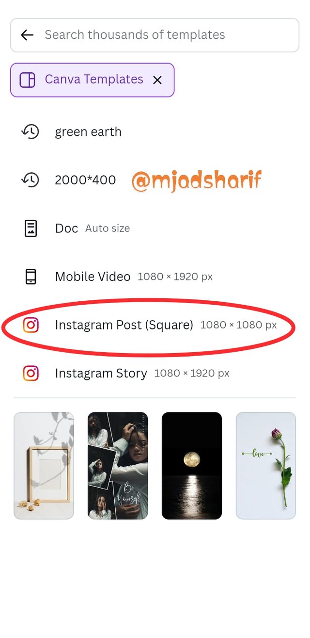
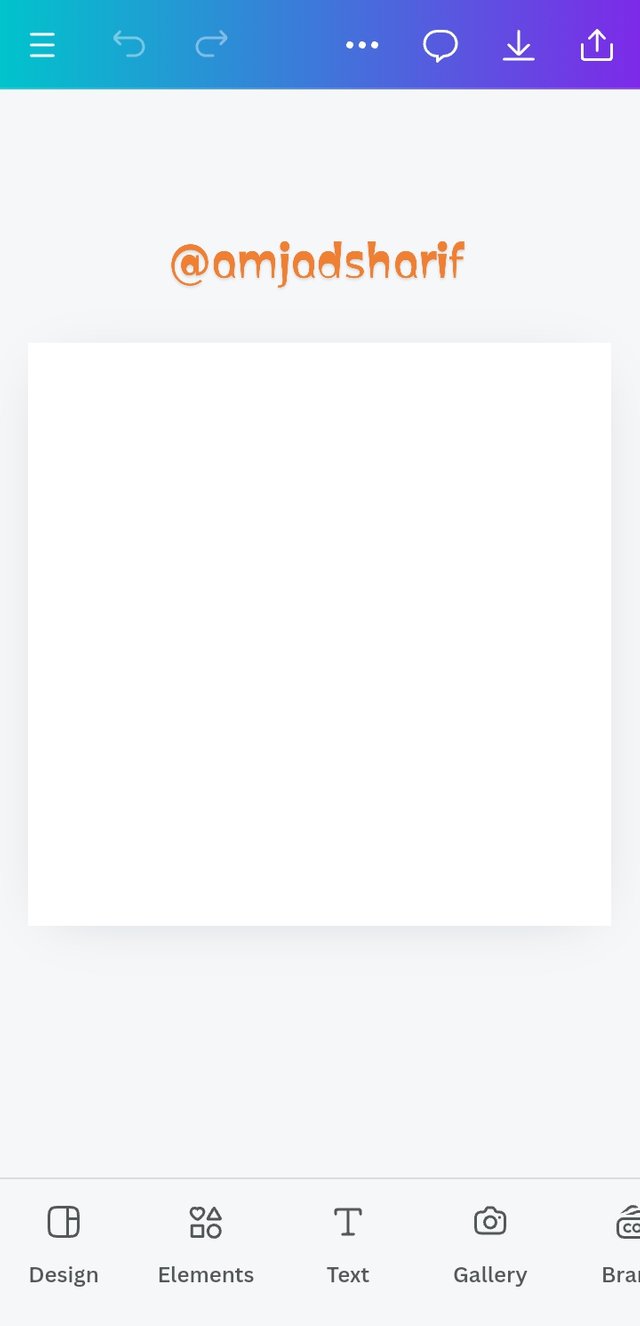
- Step 1. I opened my canva mobile app and locate the Plus " + " icon to select size, then I clicked on it. I used Instagram 1080x1080 size which I selected.
 |  |  |
|---|
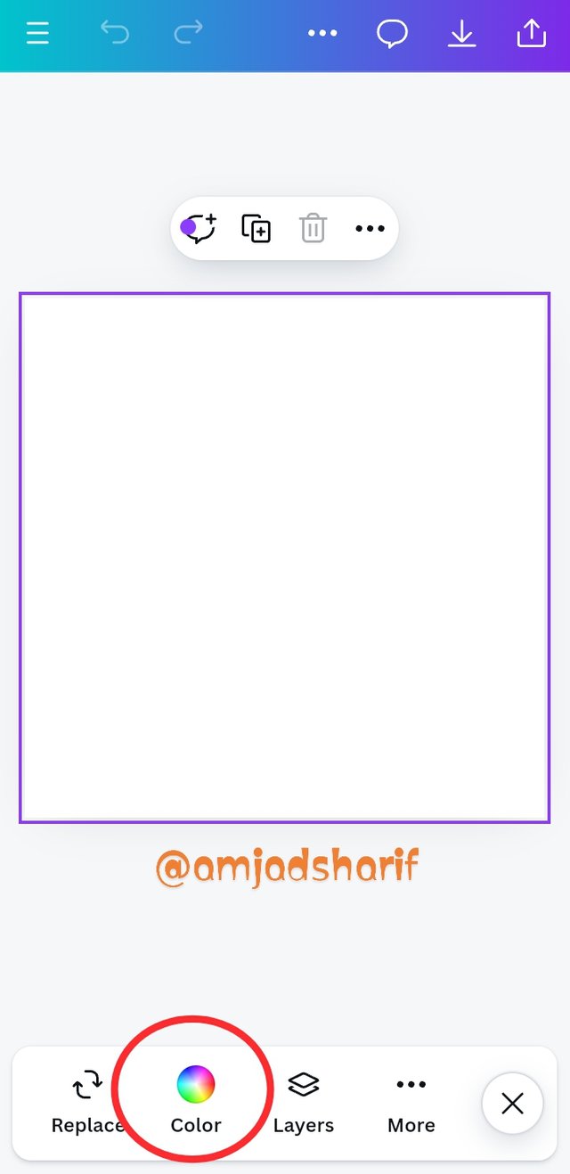
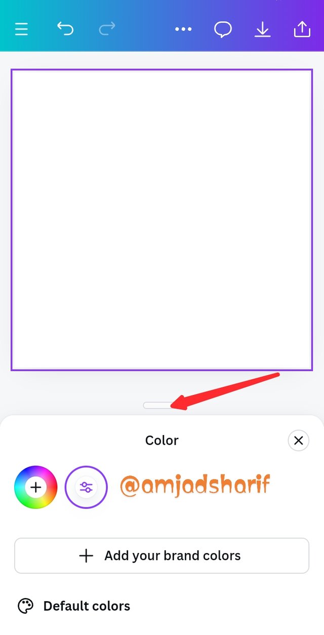
- Step 2. In this part I will change the color using the tool bar. I will drag up the highlighted part slider that shows us the variety of color from which I picked black.
 |  | 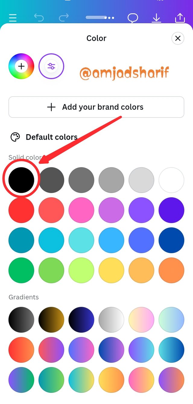 |
|---|
- Step 3. We can see now the background is changed from white to black.. Now we go to the element and click to bring circle shape. If you didn't fine you can search it.
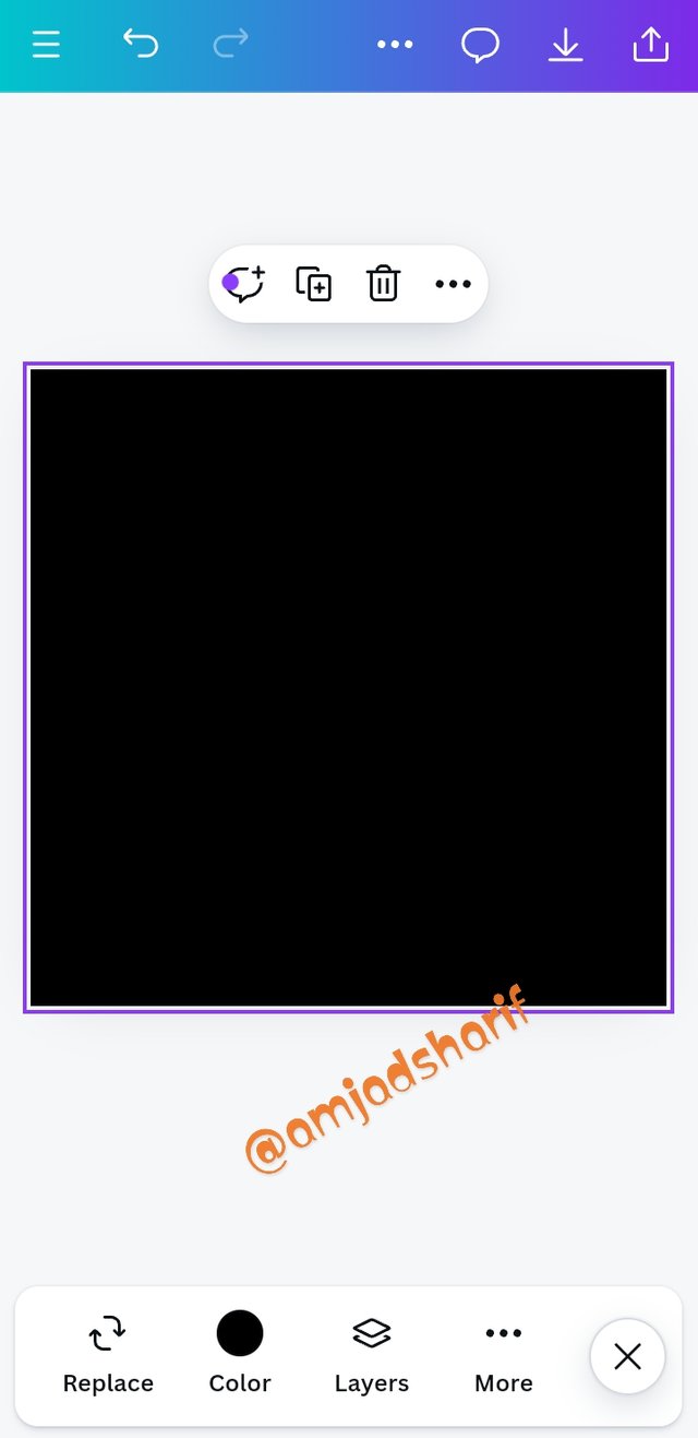 | 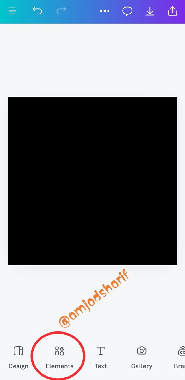 | 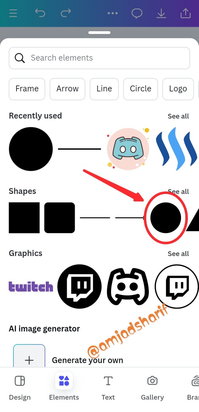 |
|---|
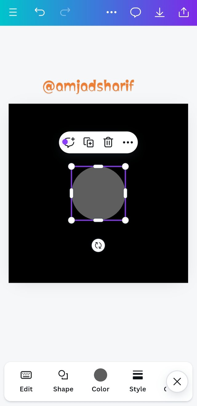
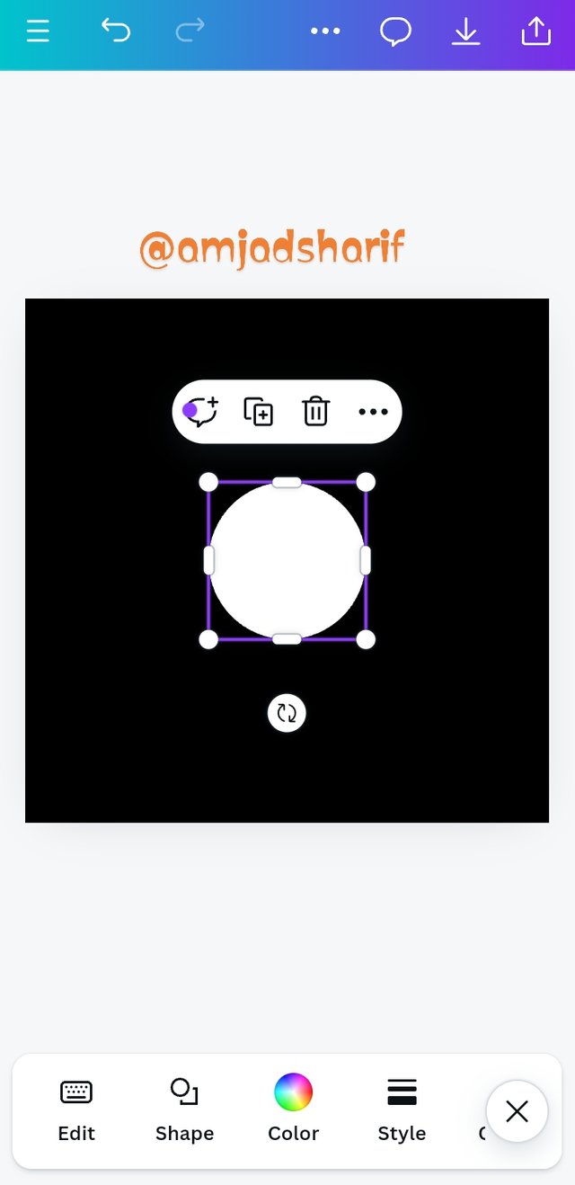
- Step 4. We launched the circle shape in our backgroun. Now we will change the color to white. As I told earlier above.
 |  |  |
|---|
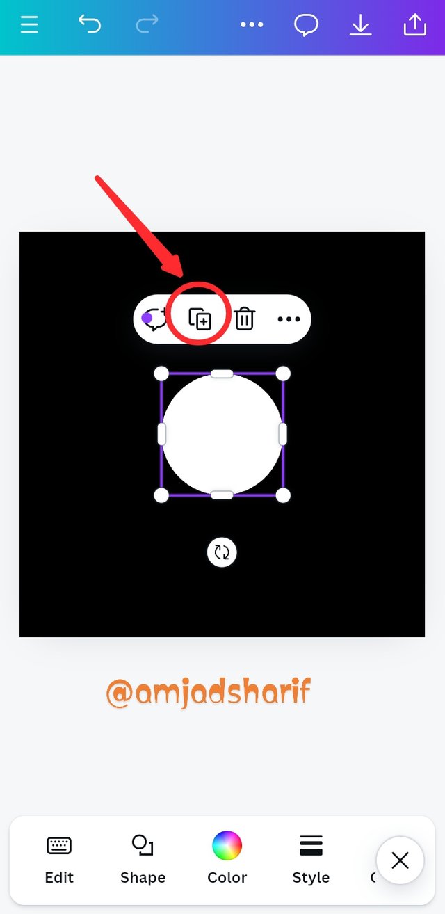
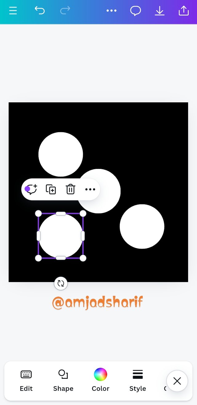
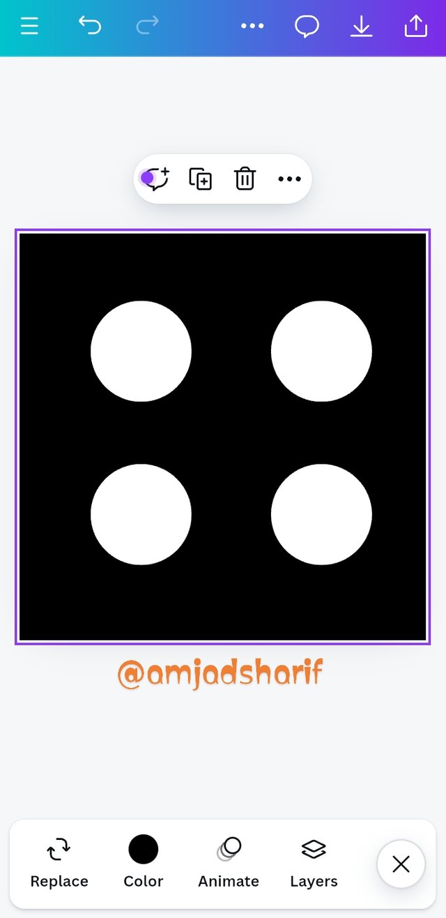
- Step 5. Now we have to more 4 circles needed, we tab 4 time in box for duplicate of the circle and then we will arrange each circle to our desire position.
 |  |  |
|---|
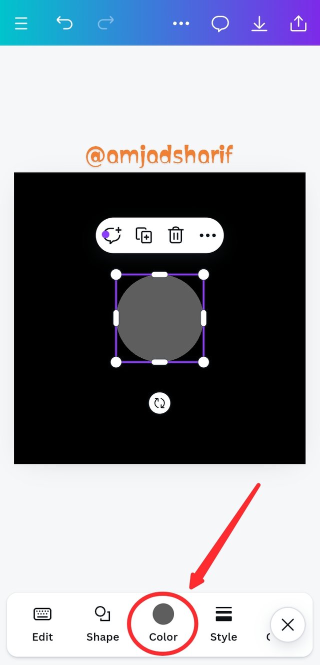
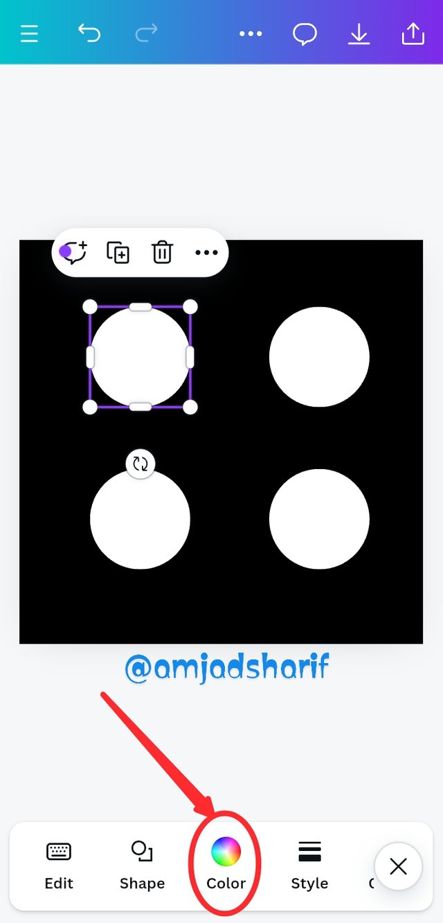
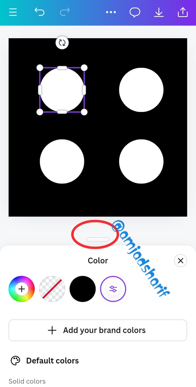
- Step 6. Just click any of circle, then go to the color panel and choose color which you want, select and apply.
 |  | 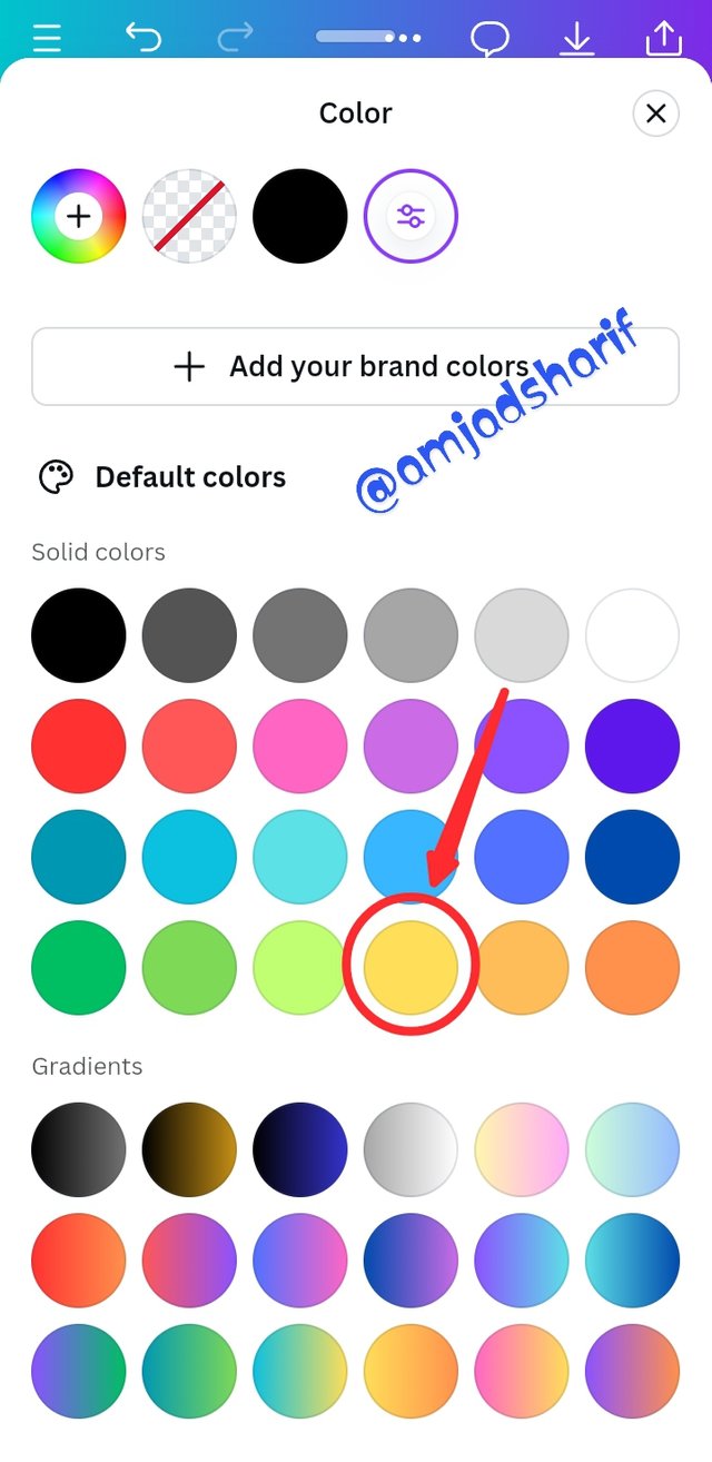 |
|---|
- Final Step 7. This the output result. of Graphic Design Course.
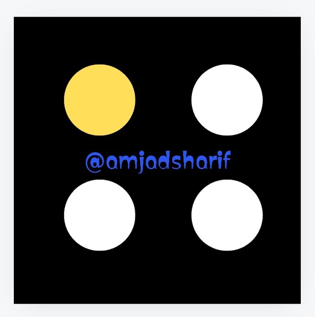 | Using 1080x1080 size/dimension. |
|---|

Conclusion
In this course of @lhorgic I learn some basic and useful things, I really impressed by my teacher.I am waiting for next week for more knowledge.
I invite @shabbir86, @sojib1996, @strong56 to join contest.
Thank You
⚠️ We Do Not Support Plagiarism❗⚠️
This account is labelled as Plagiarist
Steemit Teaching Team #wewrite
My content is 100% original if my content is found plagiarized or ai generated then it should definitely be labeled and I should not get support, first of all it should be checked and then a decision taken.
Cc: @steemcurator01
Not the one you dropped at freewriters and joined in with #we-write you took it from @jiyu99 and lied to @inspiracion.
I am not going to repeat myself since you already know.
There are plenty of communities or post in your blog who won't notice it.
Greetings to you and you.
Mam I didn't understand that post properly and I didn't lie to anyone, my fault is that I wrote it with the same idea. If I have made a mistake, is it possible to correct it?
It has always been my effort to write unique content and I have been successful in this effort, but as you have written above, no one has noticed my posts, even if someone notices, I do not care. It doesn't matter because I write Unique and it doesn't involve AI or plagiarism.
There is always room to correct mistakes, good luck
Regards
@heriadi
Thank you @heriadi, I did not make any such mistake. For which I am being punished.
WHAT? cc @wakeupkitty. Really?
It's the other you the @jiyu99 story thief.
ha!?
Hello @amjadsharif thank you for participating in this week's lesson. We have assessed your entry and we present the result of our assessment below.
Feedback:
• You have clearly defined Graphic design the way you best understand it, and I appreciate the remarkable effort you put into it.
• Your selection on the principles of design is nice coupled with your comprehensive explanation and visual representation of those principles. Kudos.
• Finally, your practical is quite detailed and comprehensive. Every step was captured from start to finish. I would like to recommend that you improve in your presentation by using appropriate markdown styles. It makes your work more organized.
Regards
@lhorgic❤️
Thank you.
@tipu curate
;) Holisss...
--
This is a manual curation from the @tipU Curation Project.